

4 Years Ago: The Coronavirus Dashboards Will Doom Us All
4 Years Ago: The Coronavirus Dashboards Will Doom Us All

I wrote this piece 4 years ago. A prelude for the terrible data decisions that doomed us

“The data collected so far on how many people are infected and how the epidemic is evolving are utterly unreliable.” — John P.A. Ionnidis, professor in disease prevention, Stanford
Look — I love data. I live in data. I dream in pivot tables, brachistochrone curves, and using AI to pick my Fantasy Football team.
But now I wonder if there will be another football season. I wonder if I’ll spend the rest of my days building Tableau charts to predict #COVID19 trends based on the flu season.
The data around Coronavirus is glorious… and gloriously flawed… and it will doom us all.
Death by Dashboard
Does this .gif give you anxiety?

It’s intended to do just that. Today you’re becoming familiar with all kinds of anxiety images — like this one:
In technical terms that’s a global geographic map layered with an aggregated proportional bubble chart and color-coded to a measure heat index, animated across a timeline.
In emotional terms it feels more like this to me as a child of the 80s:

That caption from the 1983 Mathew Broderick thriller War Games is an apt description of the unnecessary trauma foisted on the American people right now:
WINNER: NONE.
Cumulation Chaos
I’m not a virologist but I’m a decent data analyst and an excellent information architect. The deluge of deceptive data around Cornavirus is probably making you more sick than the Coronavirus ever will. Here’s why.
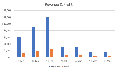
First, a quick snapshot of one of my client’s dashboards over the past few weeks (rounded and anonymized. They’ll be out of business by April so I don’t think they’ll mind me sharing this data):

If I put this on a chart it looks pretty bleak:
But watch what happens when I put a cumulative or running total across all of this:
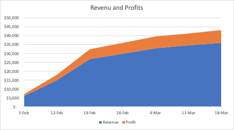
Wow! It looks like my client will be ok after all. See how the cumulative approach hides the decline?
Hiding the Real Numbers Behind COVID-19
Let’s get back to #COVID-19. Italy is a hot spot. Let’s focus on them. We’ll do this pattern in reverse. First, cumulative:
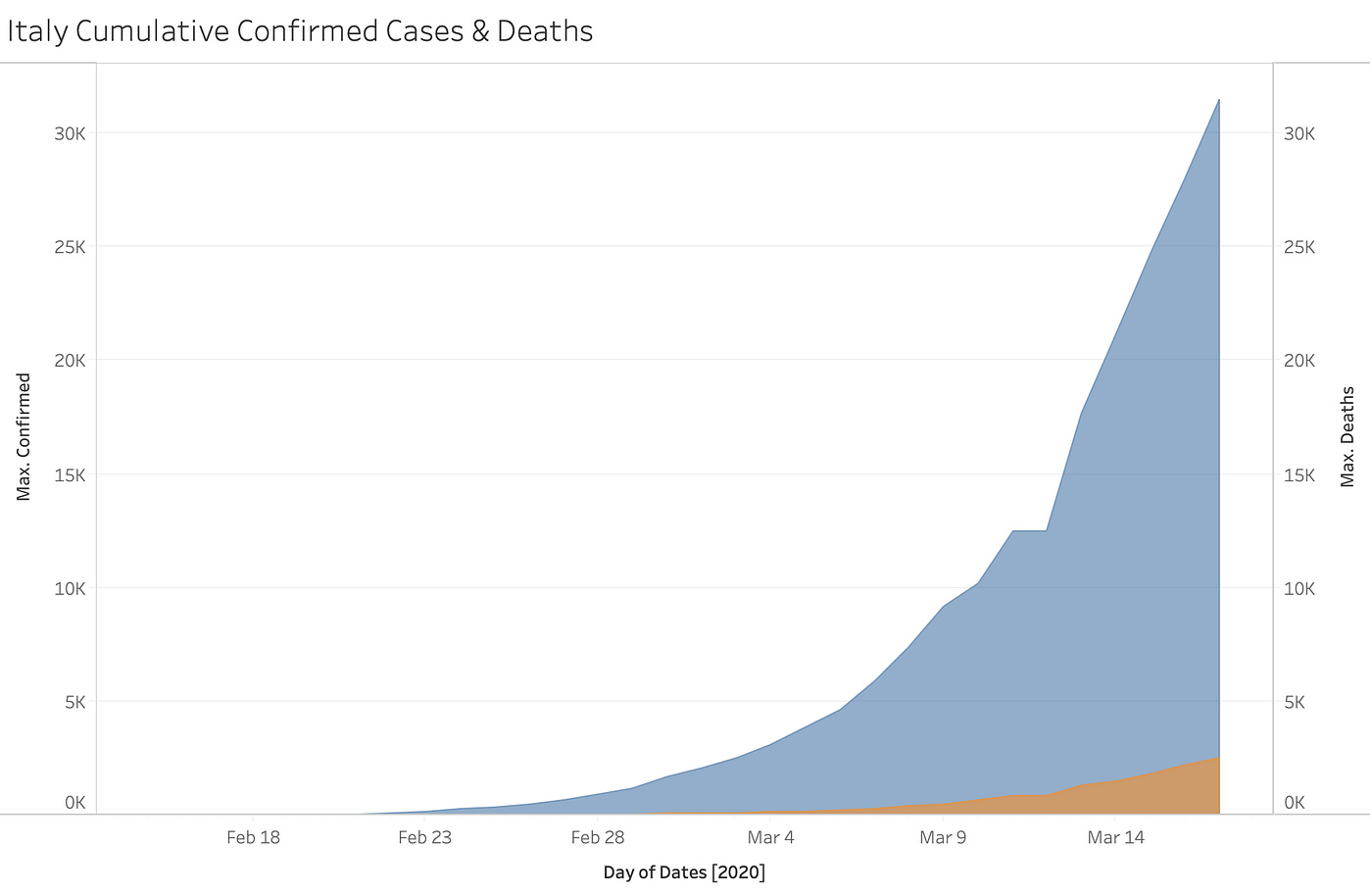
That’s a scary slope. But when we break it down day by day… things are actually curving downward.
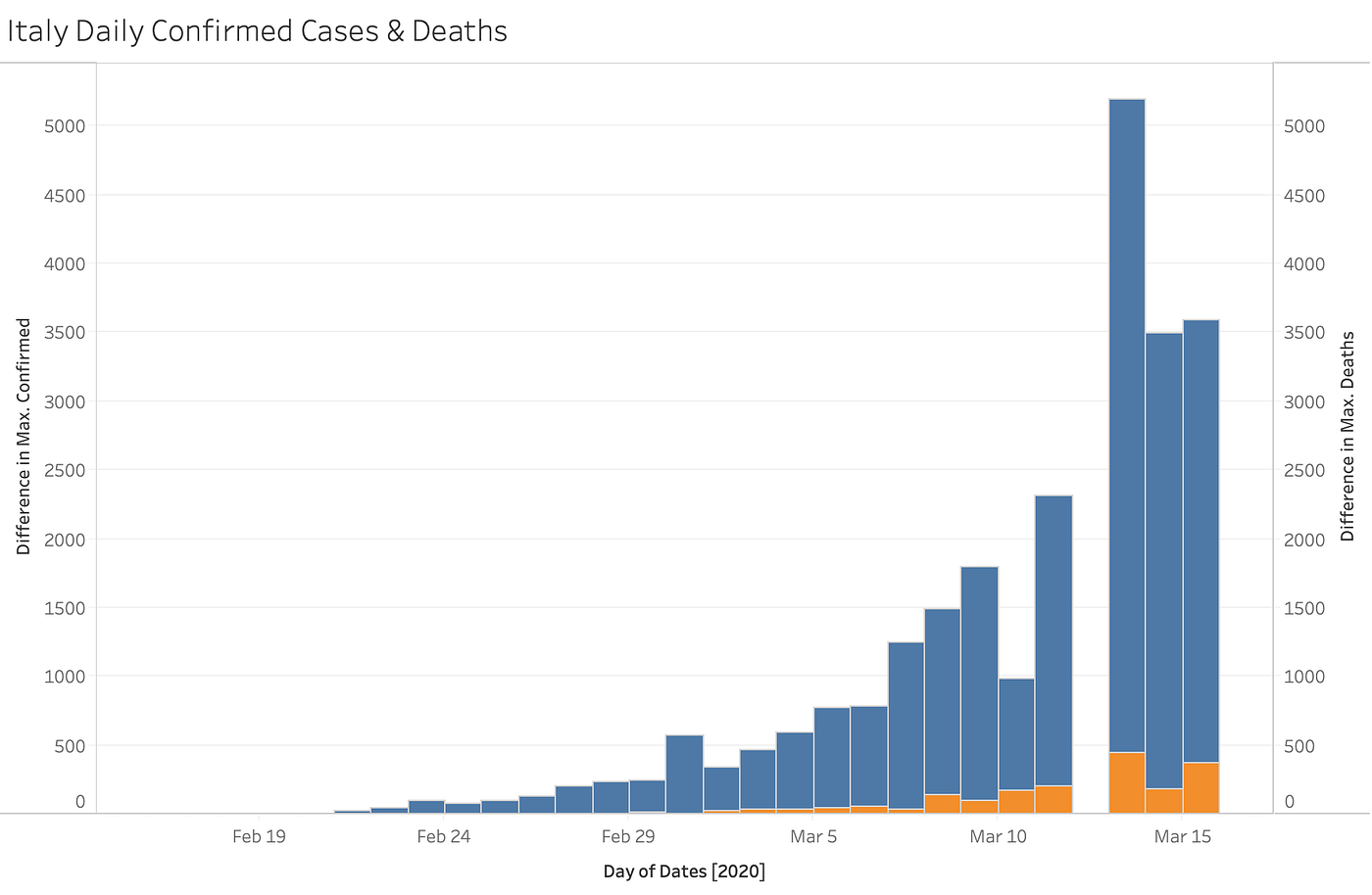
What you say? It doesn’t look like it’s going down? Keep reading until you get to the next graph on Italy a ways down.
Noisy Data
Another way to think about this is noise. When data is noisy it means that there are a lot of measures and dimensions that seem out of whack and some data points that might be missing altogether.
If I said 200,000 people are going to see a movie this weekend (as if!) and then you inferred that they were changed forever and never came back and that the scariest part of the movie is when they all went into the movie theater really quickly… well, you see what I’m getting at.
Returning to Italy. You can see above that there’s no bar on March 11th — because Italy (according to this data source) reported no new cases. The cumulative data said 12,352 for 2 days in a row!
Ask yourself… is that real? Was March 11th a magical day? Was the panic over and did people go back to work?
Nope.
There could be a number of reasons. I bet you can even think of some logical examples. The report didn’t generate correctly, a previous error needed to be accounted for, everyone went out for ripiso and decided they had better things to do.
Now, take a look at this chart showing the same data from Italy but this time they date the cases to the first day they showed symptoms.
Date of symptom onset! What a concept.
Note the BIG JUMP to nearly 500 deaths reported on the day after that gap. That’s a horrible death toll… but did they all die that day? Did they all contract the virus on the day 12 days earlier?
Ask another hypothetical: on that terrible day on March 12th how many people tested positive for the virus and died the same day? How may people were counted as a confirmed case back in February, went home, died a week later and then someone finally got around to piecing those two bits of information together.
We could do this all day.
Every actuarial in the world would love it if we humans acted like dollar bills and we could just add up everything in one cash register at the end of the day.
Counting Counties
Now let’s talk about the mess that is the United States. Take a look at some of the chart below. Notice when the dark bars extend to the right (more confirmed cases). Now, notice how many counties make up the count each day.
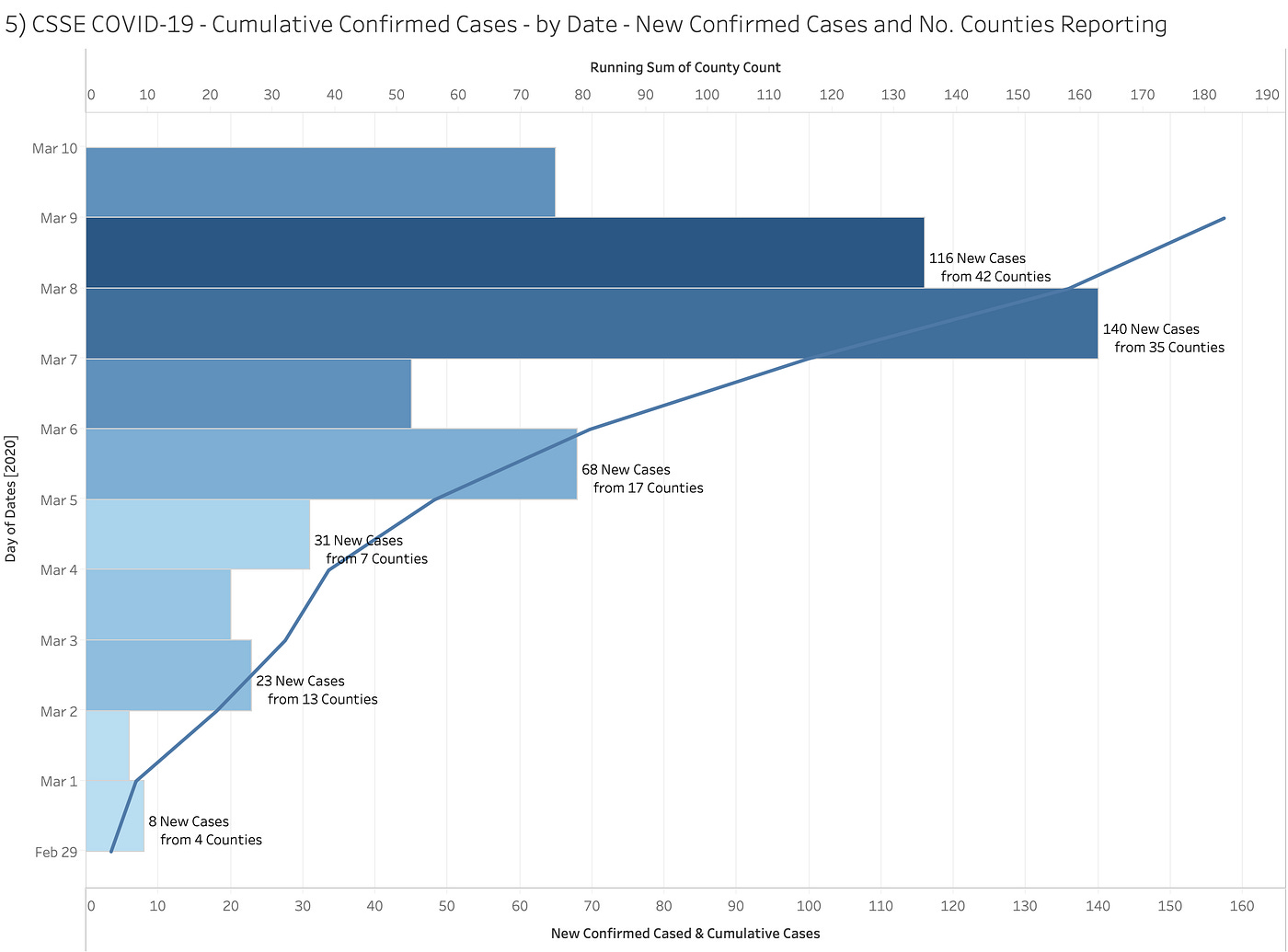
Bursts of new confirmed cases correlate to the number of counties reporting. Again, my guess is that some counties update their data when they can.
After all we’re not dealing with cash registers.
Apple knows how much money they have across every store at the end of the day. Every store is on the same system and owned by the same company.
Think of the different kinds of large hospital health providers you can think of: private, public, municipal, city, religious-based, rural, urban, big county, small county, commonwealth, children-focused, women-focused… we could go on.
In short, the data is busy, dirty, lagging, ugly, unreliable and spread across 50 states and 3000 counties and thousands of people counting heads.
When you concentrate just on the running total all of the gook just builds up to awful, awful data to scream about.
Even the CDC admits this about its seasonal flu data:
The data on influenza testing can lag up to two years after the end of the season, so for more recent seasons, testing data from prior seasons is used.
200,000 ________ ?
Context. We just passed the 200,000 mark of people infected by the Coronavirus.
Now, look at the following stats:
200,000 people died from the 2 atomic bombs dropped on Japan.
200,000 citizens have been killed in the wars in Iraq.
200,000 people contracted HIV from 1982 to 1983
200,000 people contracted the Coronavirus in the first quarter of 2020
200,000 people during this same time entered the hospital because of the seasonal flu.
If you equate 4 with anything above it… you’re a fool. A kinder interpretation is that you’ve been fooled — because of that big old dashboard.
But look over to the right too!

95% of the people who contract coronavirus are going to end up to the right… full recovered.
Here’s what that looks like:

Tomorrow… I’ll tackle the dreaded metric: mortality rate!
The Diamond Princess actually confirmed the opposite. This was not a nasty killer virus with a 4% mortality rate. I won’t quote any more statistics because I don’t want to quote them incorrectly and invalidate my point but if you dive into how many people (passengers and crew) were onboard, the age breakdown, the number infected and the number of deaths within that age stratification, what you’ll find is NIH, NIAID, CDC all knew in February of 2020 this was not something to be overly alarmed about. The real question is why did they proceed the way they did anyway?
Can you dive even deeper into Italy's daily numbers and changes? Italy helped change the entire narrative on this "killer" virus. Did wide-spread PCR testing begin earlier in Italy? What about the hospital protocols ... did they change ... if so how? Italy, the Diamond Princess and later New York City convinced everyone this was the BIG ONE - IMO It all has to have been produced by bogus testing and statistical funny business.