


2 Quick Covid Charts: Age/Ethnicity/Year

The CDC is quietly pushing out all the data that they couldn’t be bothered to publish during the pandemic. Some of it we had - some of it is new.
(reminder: they lied repeatedly)
Here are 2 quick charts that are interesting. Take these numbers with a grain of suspicion of course - what is a Covid death anyway?
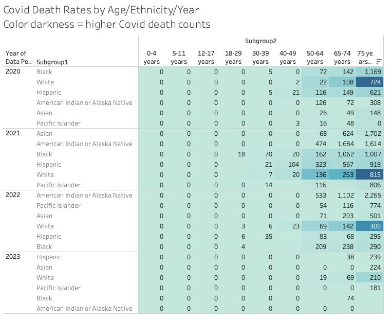
The first chart shows the rate (x/100,000 population) of covid deaths for the intersection of age and race and year. The color indicates the higher number of deaths.
Interestingly, the highest vaxxed senior group (and highest overall vaxxed ethnic group) Asians, had the highest rate of deaths from Covid in 2021.
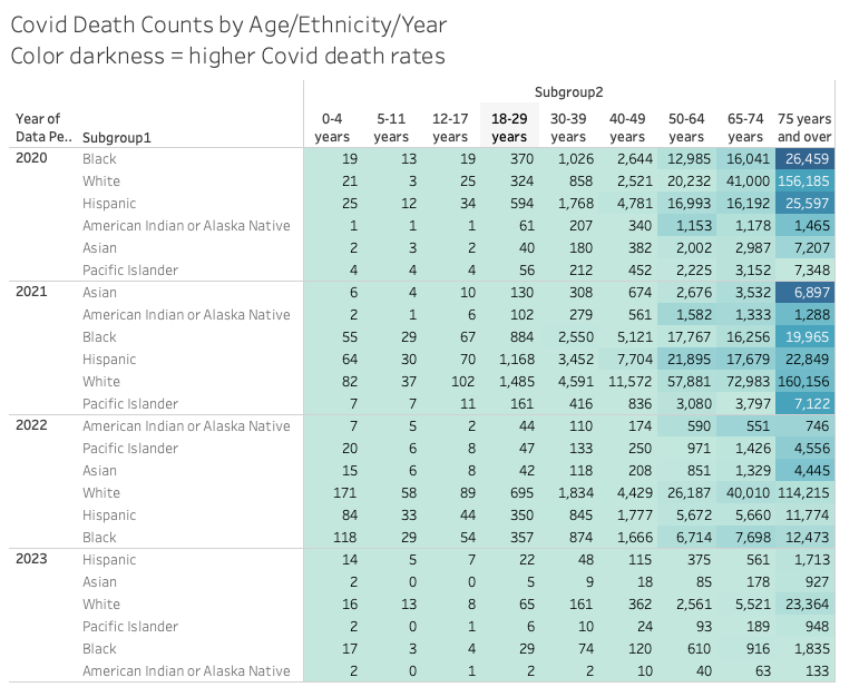
The second chart shows the inverse strata - the number of deaths for each age/ethnicity/year and the color indicates the rate.
What other insights do you see here?
Come on man. You’re chipping away at the narrative they’re going to use to push the coming conflict with China.