50% of the U.S. Population Live in Counties with the Highest Vax Rates AND the Highest Case Rates
Is this how the vaccine is supposed to work?
Join up!
Here’s the thing. RationalGround.com is supported almost SOLELY on the subscriptions to our Substack fans here. The cool feature for subscribers: interaction with Justin, the material below and frequent data downloads and insights.
Consider joining for just $7/month or $70 a year
There’s a pretty darn good visualization on the CDC COVID-19 Tracker page. It denotes the cross between case rates and vaccination rates down to the county level. We’ve noted here numerous times how the level of vaccination DOES NOT seem to be impacting the wave of cases we see across the country. This visualization CONFIRMs that suspicion.
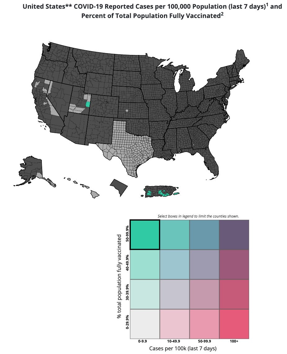
Take this map screenshot. The squares in the lower right are a clickable matrix showing case rates vs. vax rates. IDEALLY, you would expect to see that top left square to dominate the country. It’s supposed to show counties with over 50% of the total population vaccinated and with low case rates (under 10 cases per 100K people). Instead it shows only TWO counties in that category.
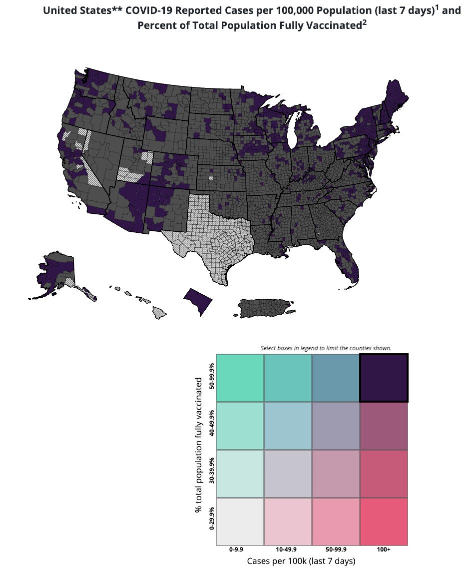
This second map shows the square on the upper right. This one you definitely DO NOT want to see dominating the scene. Oops:
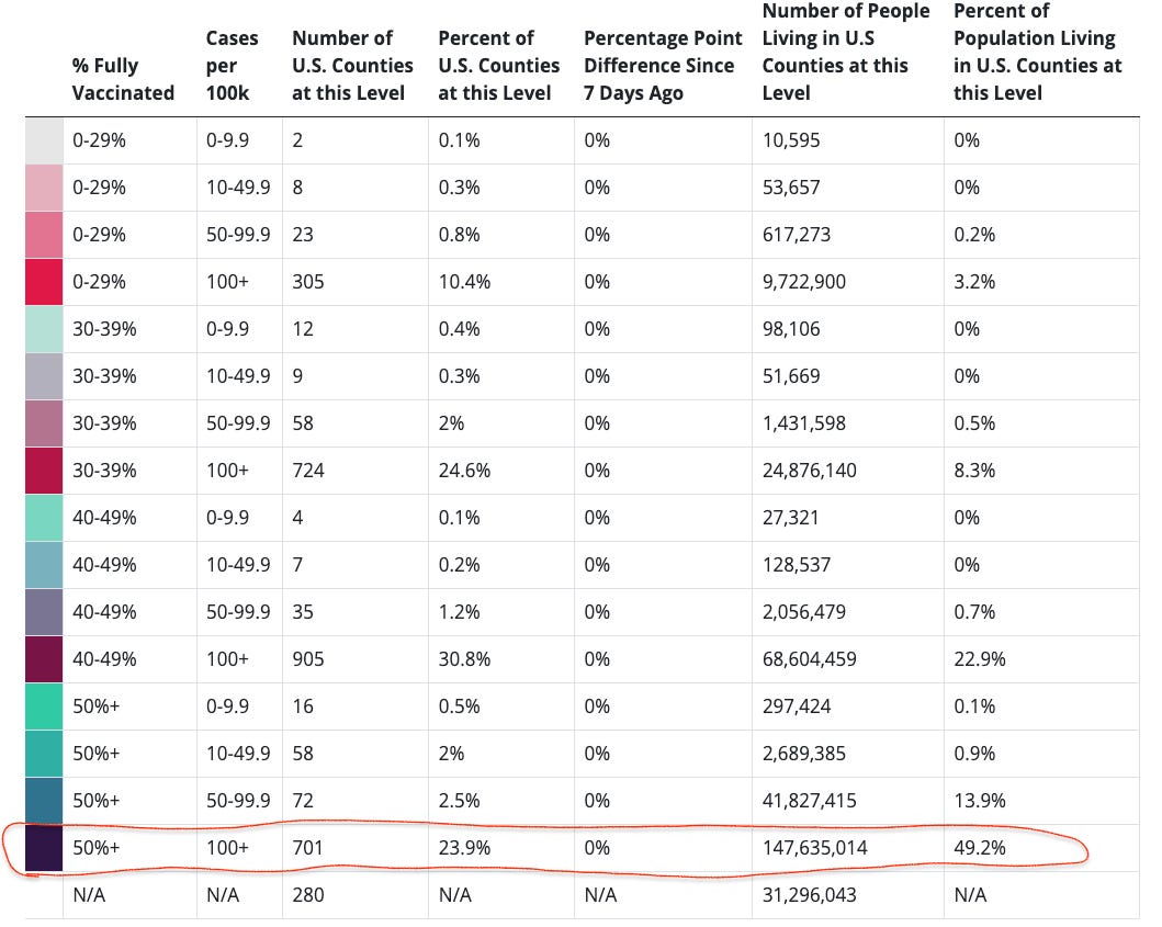
In fact, 50% of the U.S. population live in counties with the highest vaccination rates AND the highest case rates. Here’s there output table:
Note this as well! Only 3% of the U.S. Population live in counties where the vax rate is BELOW 30% and the case rate is ABOVE 100+.


Looking forward to the next post! You and Berenson do great, complementary work.