A quick Saturday post on deaths, age and ethnicity. Let’s dive in.
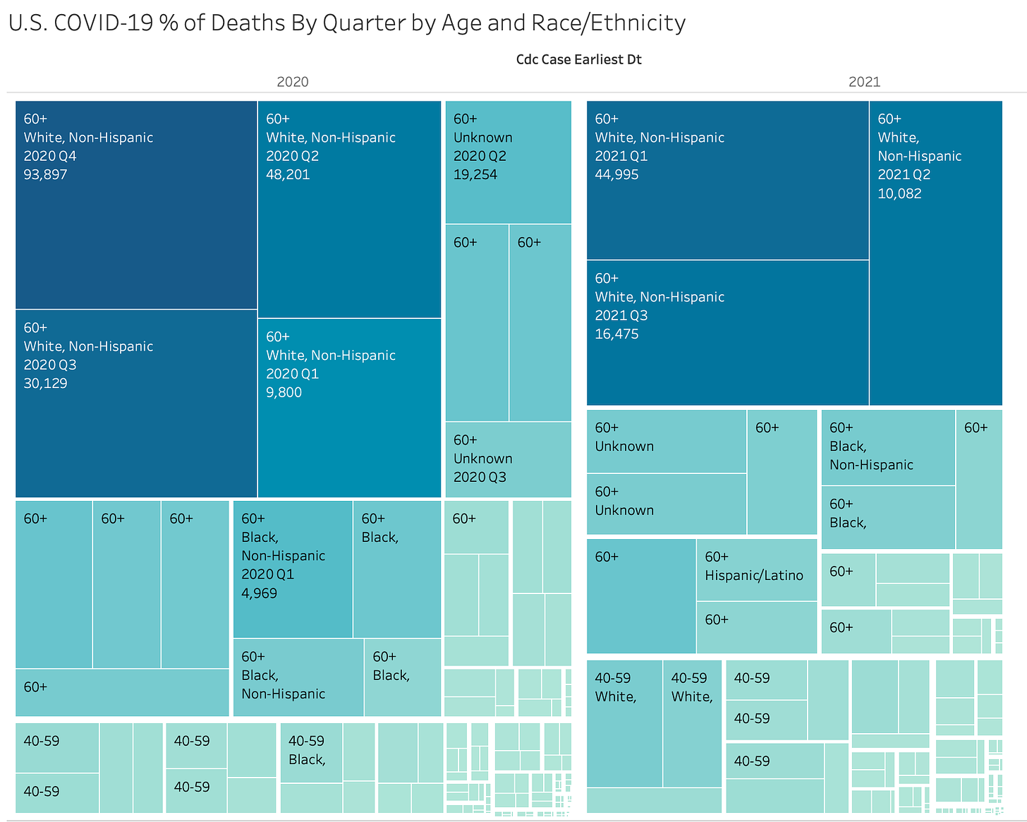
First, a Treemap chart of all deaths by quarter. Each square represents the number of deaths for an age group & race/ethnicity by quarter.
So you can see the largest grouping are Whites aged 60+ in Q4 of 2020, 93,897 deaths. Note that the file has a data problem in that a good portion of deaths have no ethnicity marked on them.
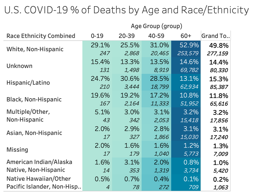
Here’s the entire pandemic outlay without date - just age and race:
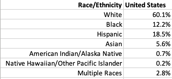
Like the general age distribution there is not a significant difference between the distribution of deaths and the distribution of race
Here’s a look by quarter. What insights can you find?


