

Bad Data Leads to Pandemic Panic Attacks
Bad Data Leads to Pandemic Panic Attacks

Rational Ground is amping up to host several conferences this year and launch some serious pandemic “clean-up” projects. Would you consider becoming a paid subscriber to our Substack today?
It only take 30 seconds to make that happen!
Our Data Problem
The data we use for COVID-19 lags, is unconfirmed and creatives massive problems as it cascades into our hands and is translated into policy. Think back on the pandemic and try to remember how many times you heard that 3000 people had died of COVID on the previous day.
Would you believe me if I told you that out of the 100+ weeks of the pandemic over 7 weeks averaged 3000 deaths per day? In fact, there are only 24 weeks where deaths averaged 2000 deaths per day. (Highlighted in red below)

The problem is data lag.
Where does our COVID-19 data come from? Most metrics originate at the county-level. There are over 3300 counties and regions in the United States. Within those counties there are various medical reporting entities: private hospitals, state hospitals, veteran hospitals, municipal emergency rooms, physician practices, you name it, we have it. All of these entities feed up their data (cases, hospitalizations, ICUs, vaccinations, deaths) up to the county, which then feeds them up to the state, which in turn feed them up to the dashboards we come to know and love.
That data can take days if not weeks and months to gather and validate. One of the biggest challenges of the pandemic is that we expected our healthcare data to act like overnight vote counting machines. Our systems were never designed to do that. When we forced them to act that way, we ended up with a lot of hanging chads and bags full of uncounted ballots.
That bad, bad data in turn was used to make awful policy decisions in a very untimely manner.
Look — I love data. I live in data. I dream in pivot tables, brachistochrone curves. I’ve used massive amounts of data to pick baby names and my fantasy football team.
The data around Coronavirus is glorious… and gloriously flawed… and it will doom us all. It truly is death by dashboard.
Does this image give you anxiety?
It’s intended to do just that. Today you’re becoming familiar with all kinds of anxiety images — like this one:
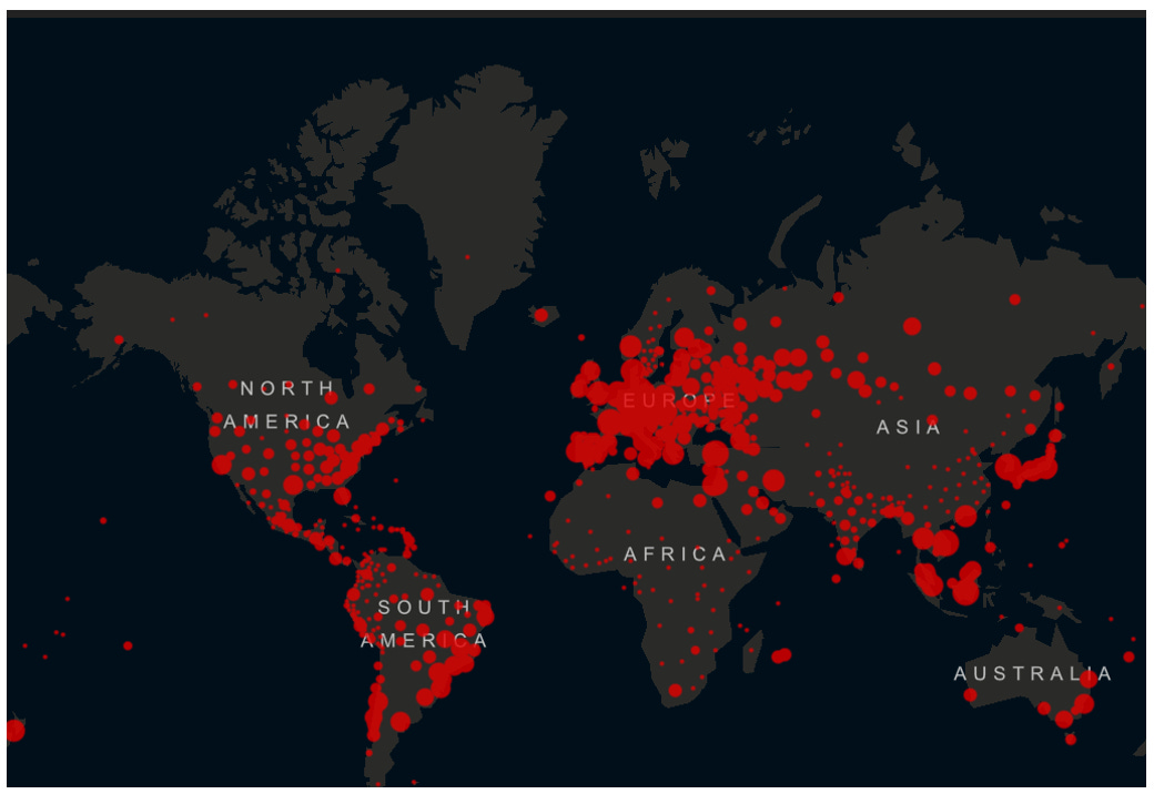
In technical terms that’s a global geographic map layered with an aggregated proportional bubble chart and color-coded to a measure heat index, animated across a timeline.
In emotional terms it feels more like this to me as a child of the 80s:

That endgame caption from the 1983 Mathew Broderick thriller War Games is an apt description of the unnecessary trauma foisted on the American people right now: WINNER: NONE.
Charles Babbage, tinkerer extraordinaire who essentially created computer programming put it this way:
On two occasions I have been asked, “Pray, Mr. Babbage, if you put into the machine wrong figures, will the right answers come out?” … I am not able rightly to apprehend the kind of confusion of ideas that could provoke such a question.
— Charles Babbage, Passages from the Life of a Philosopher
So the next time someone freaks out about recent deaths just let them know that the data is garbage and the policies we make FROM the data are worse still.
The most famous example of this adage is the disastrous launch of Euro Disney. Massive projections and huge datasets were crunched and primed to estimate the number of visitors to the new theme park outside of Paris. Hotels were erected to handle the weekly rush of tourists; food delivery chains were devised to feed the hordes; and the scale of handrail queues were orchestrated for a deluge of Big Thunder Mountain Railroad riders.

The numbers were all off because of one key stat: the number of vacationing days per family visit. The assumption was that the European version of the Griswolds would pull up in their Volvo station wagons to enjoy at least 3 to 5 days at the great American import.
That stat was woefully off. The true number was much lower and every stat in the spreadsheet was garbage after that. It would take a decade for Euro Disney to recover.
Mortality Rates
Take the claim that COVID-19 has a mortality rate of 3% or higher and is twice as deadly as the seasonal flu. This was the initial claim given to us by the WHO and the Chinese. Later, Dr. Fauci would claim in front of Congress that it was 1%. These figures are vastly overstated.
Mortality rate gauges the % of deaths of people who contract a specific disease. The calculation is far more complicated than that but that’s the gist of it. So, the high impact 2017–18 flu season had approximately 61,000 deaths and an estimated 44 million infections in the United States. That comes out to roughly .14% (14 tenths of 1%). In other words, for every 10,000 people who get the flu, 14 people would die.
The table below shows the “burdens” of the 2017-18 flu season by age bracket. These are the same “burdens” I mentioned earlier.

Data taken from CDC estimates for the 2017–2018 severe flu season.
So what? Is the overreaction to a viral pandemic that only comes around every 100 years really that bad a thing? I mean - better safe than sorry right? But that’s just it. We weren’t made safer.
Let’s look at two big date ranges. June 2020 through February 2021 and June 2021 through February 2022. I chose these ranges because one set consists of the prime months where lockdowns, business, and school closures were prominent, and the second range shows the impacts of vaccines. This removes the early and hugely impactful early segment of the pandemic (Spring 2020). When you map one date range (orange line) on top of the other (blue line) you can see the difference in the waves of deaths:

This shows the decent surge of deaths during the winter of 2020 to 2021 and the wave of deaths during the summer of 2021.
When you add it all up and do a “running total” – a cumulative count of deaths for each date range mapped on top of each other you quickly realize there is little to no difference:

All of these charts should tell you a few things:
1) Your risk is probably relatively low. For the vast majority of people COVID-19 is something you will survive just fine.
2) The data that we do have is seriously lacking. It will be years before we truly know the impact of COVID-19 but based on what we know know the data vastly overshot the actual deaths and “burdens” which have been touted by officials and the press
3) We have a lot of work to do to convince people of the world to sharpen up their skills and question everything they see.
CDC provisional data only lags 6-8 weeks
https://www.cdc.gov/nchs/nvss/vsrr/covid19/index.htm