


Charts: Cases by State
Get a reference to every state with a new set of charts.

I’ve been using the New York Times Github download for a lot of my case and death data but frankly… it has some problems. The data source is one of the only ones that goes down the county level so it’s extremely valuable but once you start rolling up… problems appear. For example, one of our subscribers pointed out that Florida deaths for September were above 26K (they weren’t) instead it appears that the NYT failed to gather info for FL in July and August and pushed it all into September. (Upsetting).
So I’m using a new CDC data set and we’ll start at the state level.
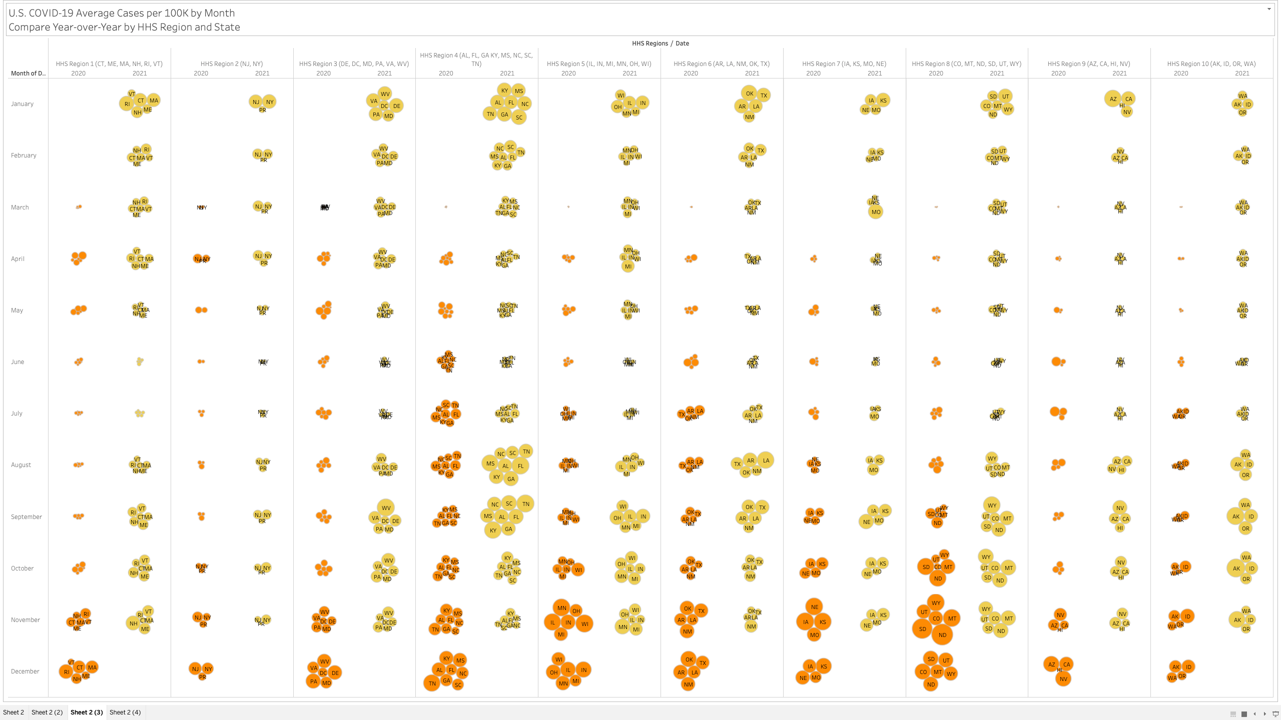
Here’s an interesting view… you have to go full screen big screen to see it all but it showing 2020 vs 2021 by month and HHS region. The size of the state bubble denotes the size of the average cases per 100K for that month.
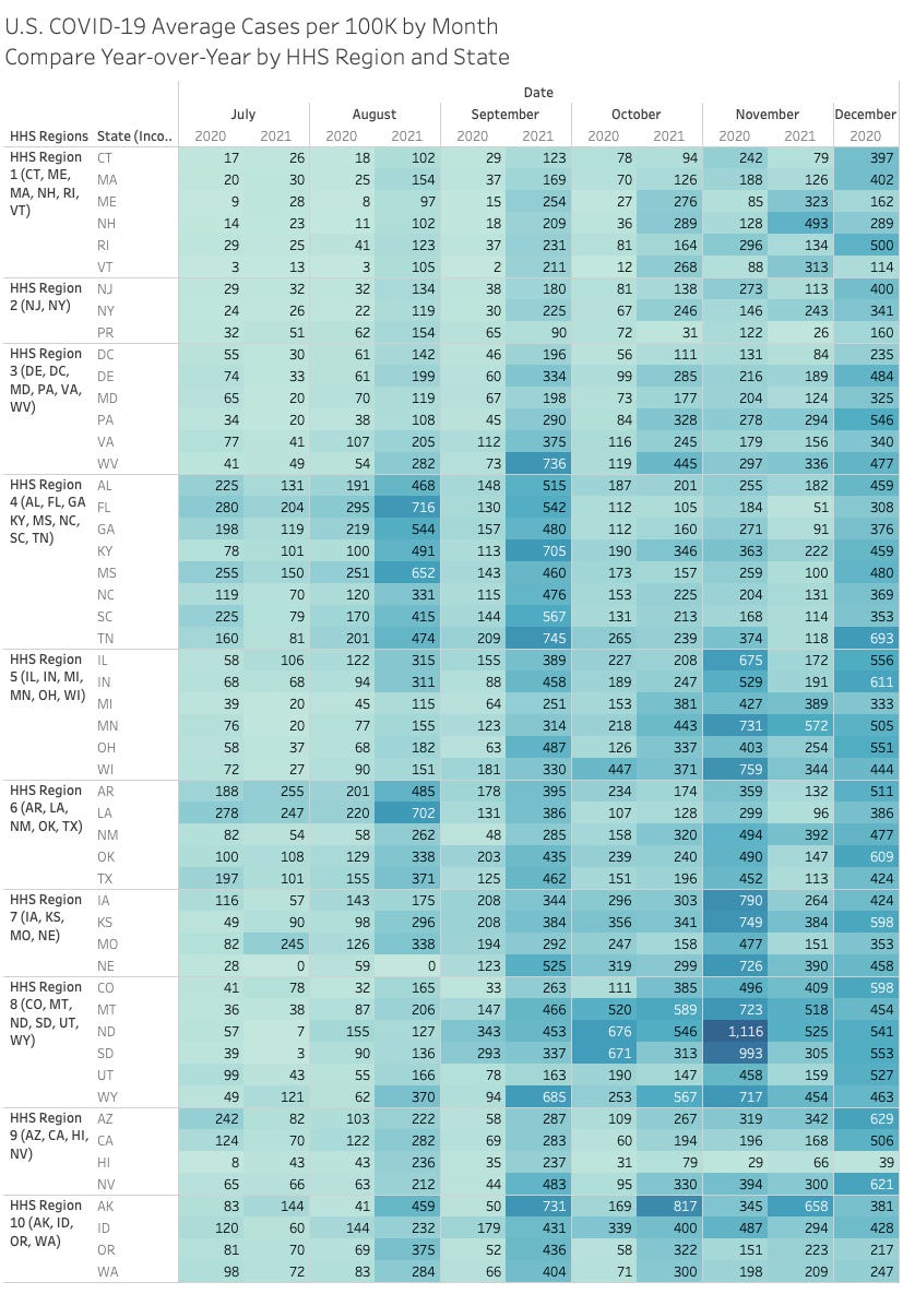
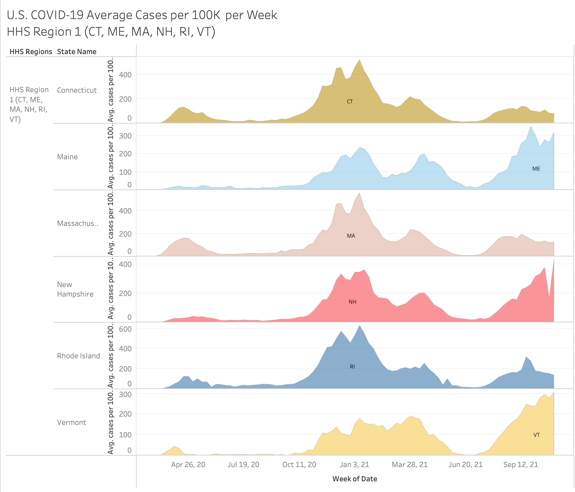
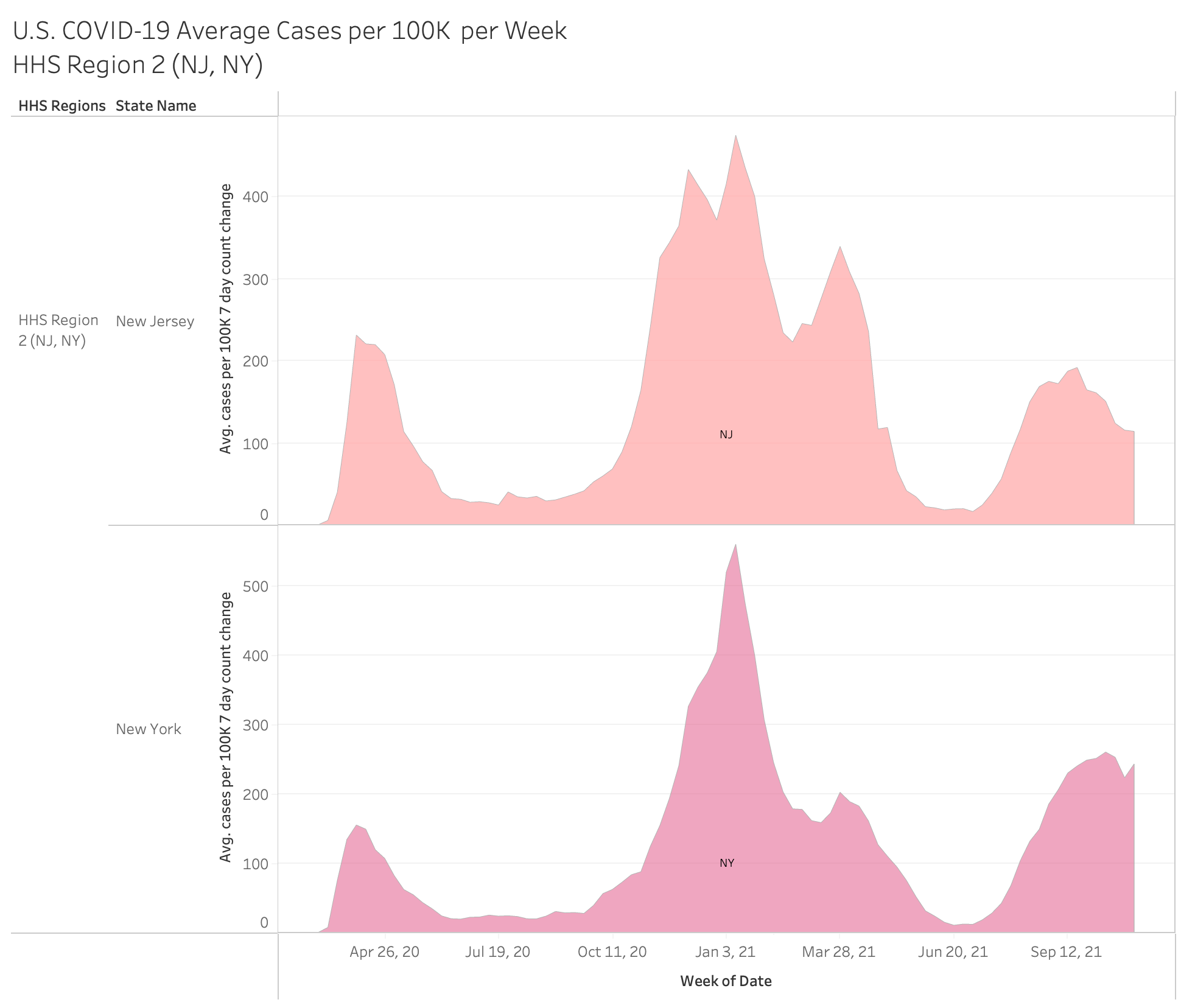
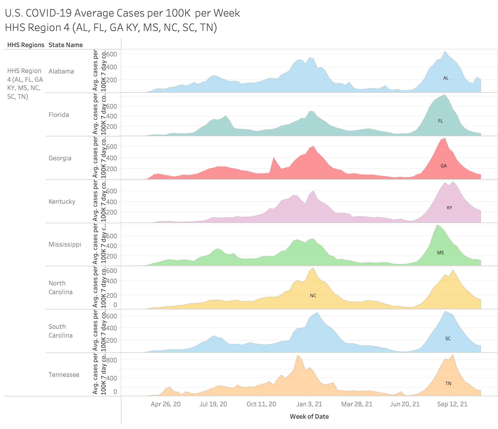
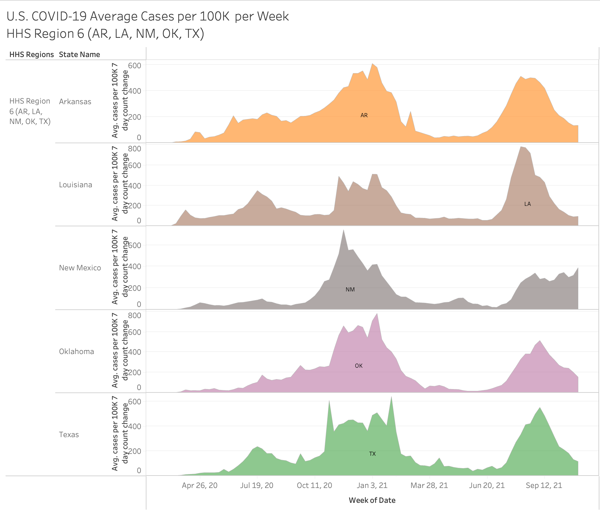
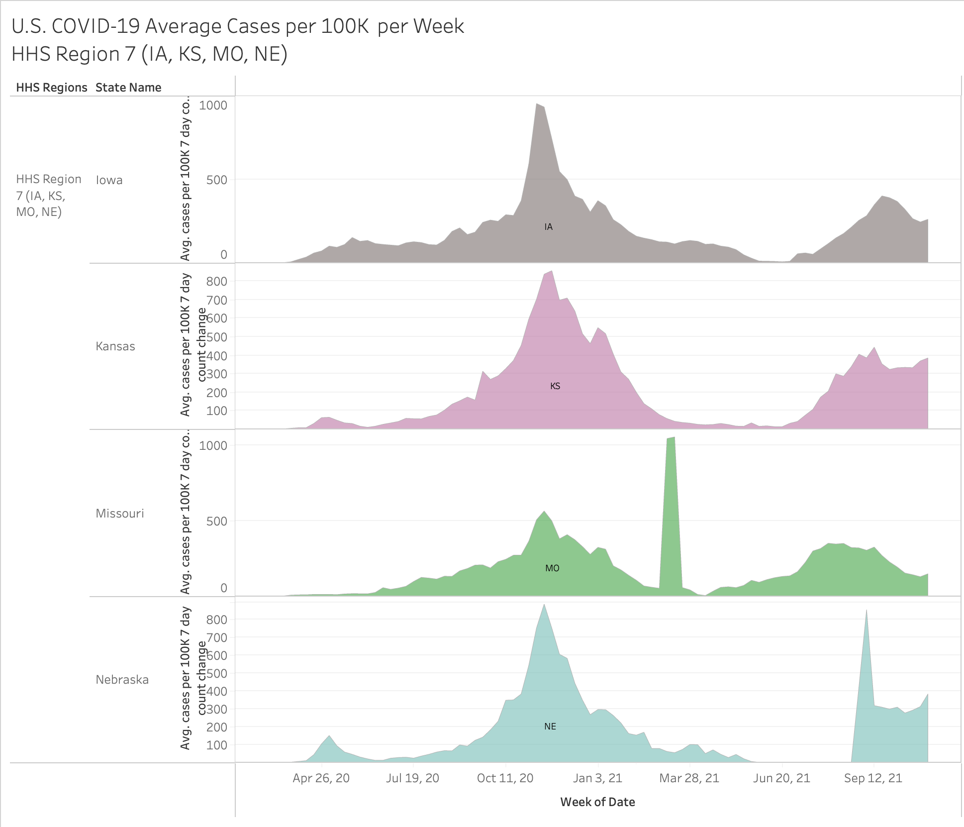
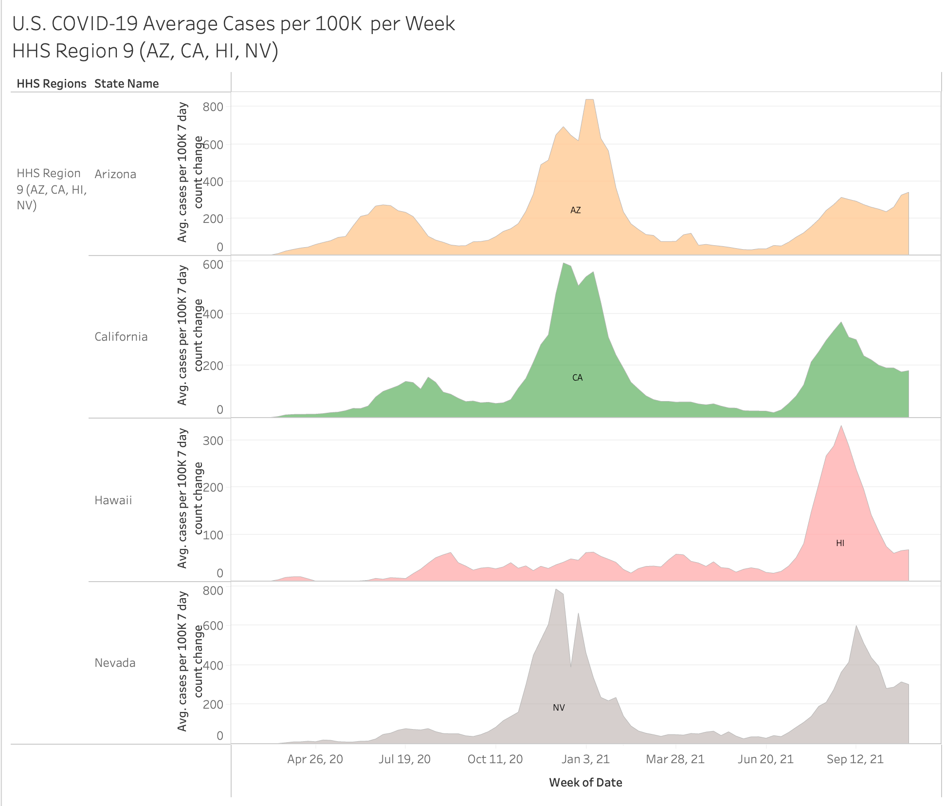
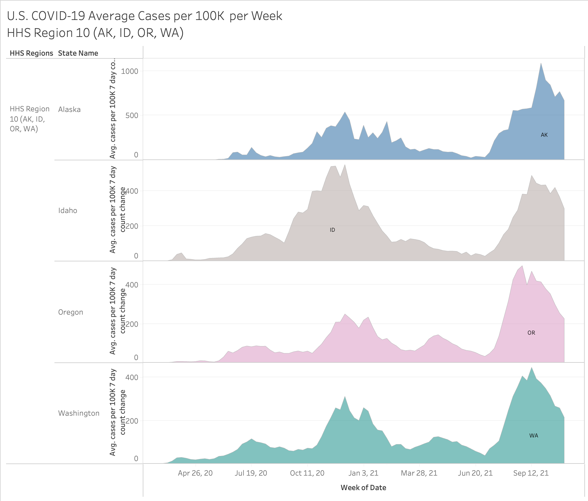
Here are the individual full pandemic cases per 100K by HHS region
First, the table:


Thanks
There was an unusual extra curve in Michigan. That might be interesting--not just data reporting.