Garbage In, Garbage Out. Bad Data Will Kill More People Than COVID Ever Will
This pandemic panic runs on bad, bad data
Look — I love data. I live in data. I dream in pivot tables, brachistochrone curves, and using AI to pick my Fantasy Football team.
But now I wonder if there will be another football season. I wonder if I’ll spend the rest of my days building Tableau charts to predict #COVID19 trends based on the flu season.
The data around Coronavirus is glorious… and gloriously flawed… and it will doom us all.
Death by Dashboard
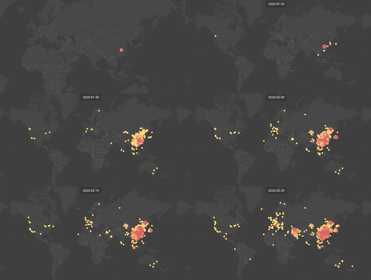
Does this .gif give you anxiety?
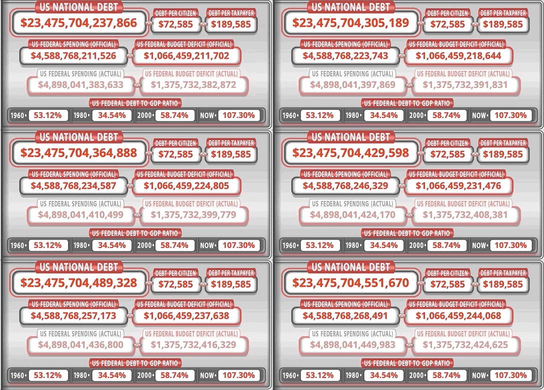
(note: older gif… if you really want fear look up the debt now!)
It’s intended to do just that. Today you’re becoming familiar with all kinds of anxiety images — like this one:
In technical terms that’s a global geographic map layered with an aggregated proportional bubble chart and color-coded to a measure heat index, animated across a timeline.
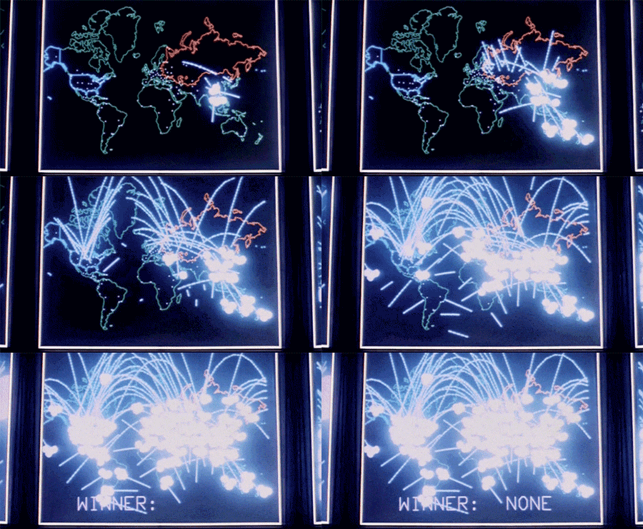
In emotional terms it feels more like this to me as a child of the 80s:
That endgame caption from the 1983 Mathew Broderick thriller War Games is an apt description of the unnecessary trauma foisted on the American people right now:
WINNER: NONE.
Bad Data Breeds Bad Policy
So get this. Latest CDC data added 50 new #COVID19 deaths for children under the age of 10. But:
Only 16 of those were in Sept/Oct - 23 of them were in 2020
15 new deaths were added for April 2020!
It matters b/c the media freaks out, policies are reinserted and kids suffer.
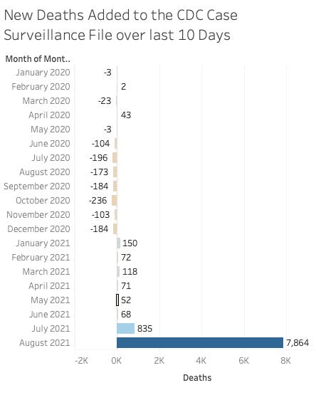
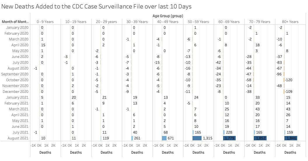
It gets worse. The CDC added another 10 days of "verified" data to their case surveillance file. Here's where (month) they added AND DELETED deaths in the file.
Here it is by age:
So the next time someone freaks out about recent deaths just let them know that the data is garbage and the policies we make FROM the data are worse still.


Norton told me that this page was dangerous this morning. Doesn't look that dangerous.
Nobody but us data conspiracists to hold them accountable…eh?