

I can't believe my county is so Blue! How about yours?
I can't believe my county is so Blue! How about yours?

Have you wondered if your county really is that Red? Or in my case, is my county really that Blue? I've got the tool for you!

In our ongoing effort to provide you with robust tools, data, and analysis for this upcoming election cycle, I’ve compiled a historical window on presidential elections down to the county level from a myriad of different sources.
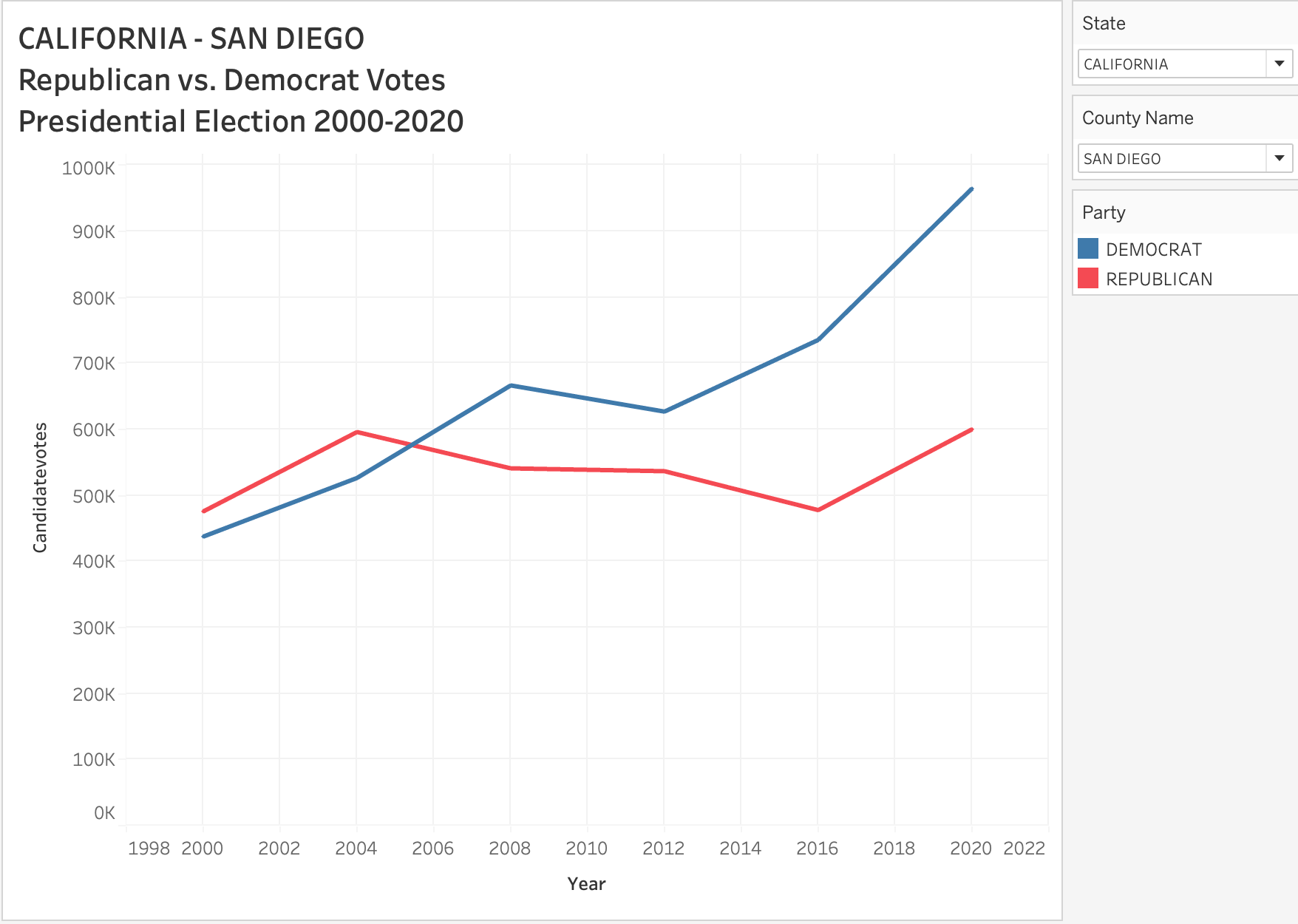
Using data from MIT I have an interactive chart for subscribers, which allows you to see presidential election results from the year 2000 up until 2020. Soon we'll have this down to the precinct level, but this gives you a pretty good idea to see how your county has shifted and changed over the years.
INTERACTIVE TOOL FOR SUBSCRIBERS BELOW
Keep reading with a 7-day free trial
Subscribe to Rational Ground by Justin Hart to keep reading this post and get 7 days of free access to the full post archives.