The CDC Sase Surveillance File is a national look at the core stats of the pandemic. They also have a geographic file but there are serious data limitations. Sticking with the national file however we have decent data on age and race/ethnicity breakdowns.
For example, we can see the hospitalization rate across the months by age group:
This mirrors our expectation that the pandemic has had a significant impact on older Americans. One insight is that the median age of death for COVID-19 is about the same median age of death for anything else. In fact, down to the county level, the data supports the idea that you are just likely to die of anything else as you are of Covid. In other words - there has been very little impact to actuarial tables (more on that at another time).
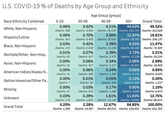
Generally, with race and ethnicity we find that the distribution of deaths also seems to follow population distributions. Here’s a breakdown of age and race/ethnicity provided by the file into a table with a heat color showing the % of deaths for the entire pandemic for that intersection of age and race.
So you can see that 49.5% of deaths have been incurred by White/Non-hispanics.
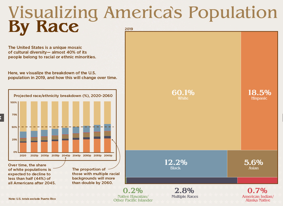
Visual Capitalist shows the U.S. population distribution of race like this:
When you take “Missing”, “Unknown”, and “Other” from the CDC file and distribute it across the groupings this would bring you close to the general population distribution.
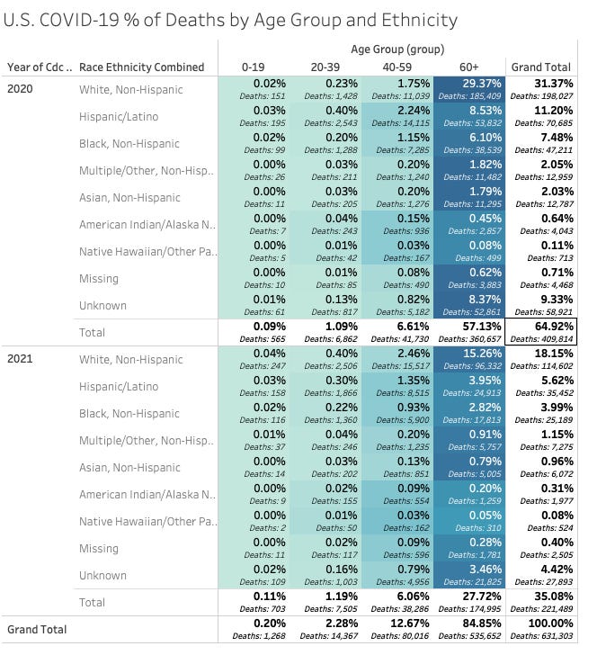
When you break it down by year you realize there were a LOT of deaths up front in this pandemic. So, in the chart below, 30% of all deaths were from Whites in 2020.
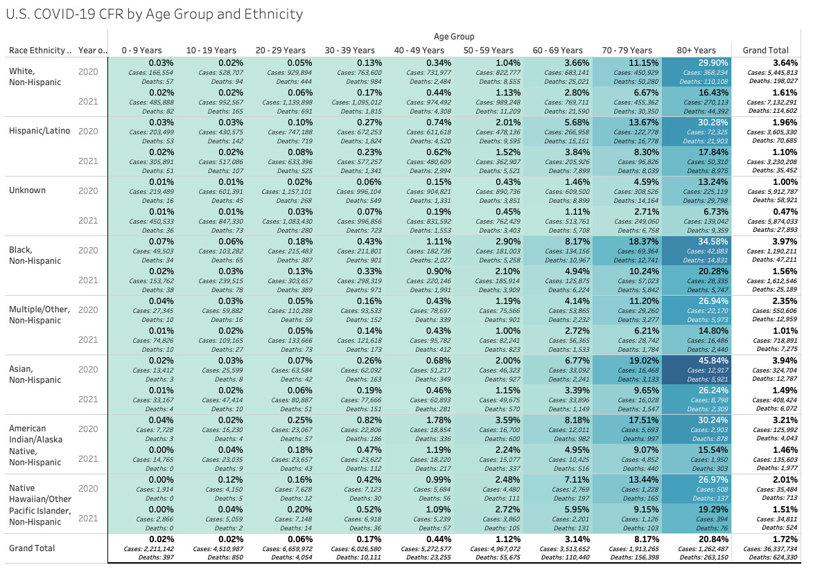
But let’s dive deeper. Here’s a chart of MORE granular age breakdowns showing the Case Fatality Rate (CFR) for each race and by year. Remember, Case Fatality Rate can be skewed by testing but this does give us some insights.
In this chart the % of the CFR with cases and deaths for each group by year:
Some callouts:
Notice for Black, Hispanic and Asian elderly the case fatality rate is very high. especially in 2020.
Minorities over 60 years old seem to have significantly more risk than Whites.
What other insights do you see?


When looking at trends in death, is important to focus on the older age ranges. There are so few deaths in the younger age ranges as to make trends almost meaningless. (Coupled with the discrepenany over deaths by/with, any perceived trends in younger age ranges are probably entirely meaningless except to say that healthy, young people don't die of this).
What stands out shockingly is how low the death numbers are in the older age ranges when the race is Unknown. Raises questions about the data collection once again. The Unknown category has the lowest death rate by far. Seems there might be a bias involved.
Also, am shocked by the numbers for Asian-Americans in the older age ranges. On average, adult Asian men in the US weigh about 40 lbs less than white men. White men weight just more than black and Hispanic men. Why did older Asians die at such high rates? (In fact, Asian adults died of corona at high rates across the board). Once again, I can only assume bias in reporting data unless there is something particular to Asian-American biology or lifestyles that would make death from corona so prevalent. Or it could be that many Asian-Americans were counted in places like NY where patients died at high rates early on (likely because the hospitals killed them with detrimental treatments).
Finally, the huge drop in all death rates from Year 1 (2020) to Year 2 (2021) raises further serious questions. Was this because of new treatments? Was it because of "vaccines?" Was it because reporting was changed? Was it because they stopped actively killing patients with detrimental treatments?
Very interesting! Do you know how many of the people were "covid-vaccinated" in these statistics?