Race and COVID-19
Let's understand the differing impact of the pandemic on various ethnicities.
This is a touchy subject - so I’ll just stick to the data and call out some interesting details. Like seriously - don’t cancel me if I step in it! Landmines everywhere!
IMPORTANT DEADLINE IN OCTOBER
Speaking of cancelling… are you a subscriber yet? I’m not long for the Twitter world if history holds up so I’m asking people to get themselves onto this newsletter and - if you would - consider becoming a paying member.
What do members get? Well today I’ll be uploading a massive cross-tab from the CDC Case Surveillance file. That bugger is 4GB large now with 34 million rows. Excel can’t handle it so I parse it down for paying subscribers and send them an easy-to-read data set. Create your own charts with it!
Also - I give paying subscribers my email deets and we’ll be coming out with our own chart group soon.
Basic Cross-tab: Race and Age
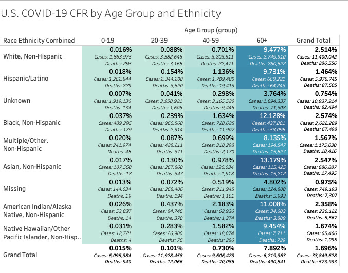
This table is pretty simple. It notes the % of deaths at the intersection between race/ethnicity and age - as specified in the CDC Case Surveillance File.
One interesting side-note here: we know that age is the orimary predictor of how you will fare if you contract COVID-19. As we’ve noted previously - you are just as likely to die of anything else as you are of COVID. The risk of dying of C19 at 20 years old is about the same risk of a 20 year old dying of anything - very low.
What’s interesting - taking the pandemic as a whole - the % of deaths across racial and ethnic lines - as a whole - maps out pretty closely to the population as a whole.
White, Non-Hispanics make up about 53% of the U.S. population and account for 49.9% of all deaths
Hispanics make up 15% to 20% of the population
Black, Non-Hispanics - 13%
Asian - 6%
This is a pretty “equitable” distribution of the overall deaths among the population. I think this is one more strong evidentiary point to confirm our suspicions that our COVID-19 case and mortality monitoring is just picking up regular deaths. As David Zweig reported a few weeks ago, it could be that HALF of all hospitalizations were not admitted for COVID-19 at all as a primary reason for admission. We’ll have to wait and see. Excess deaths will be an important subject.
Case Fatality Rate and Race
Digging deeper into the mix we can examine age and race and the case fatality rate (CFR). The case fatality rate relates the number of deaths compared to the known and confirmed cases of the disease. The infection fatality rate (IFR) denotes the % of deaths related to the total infections among the population.
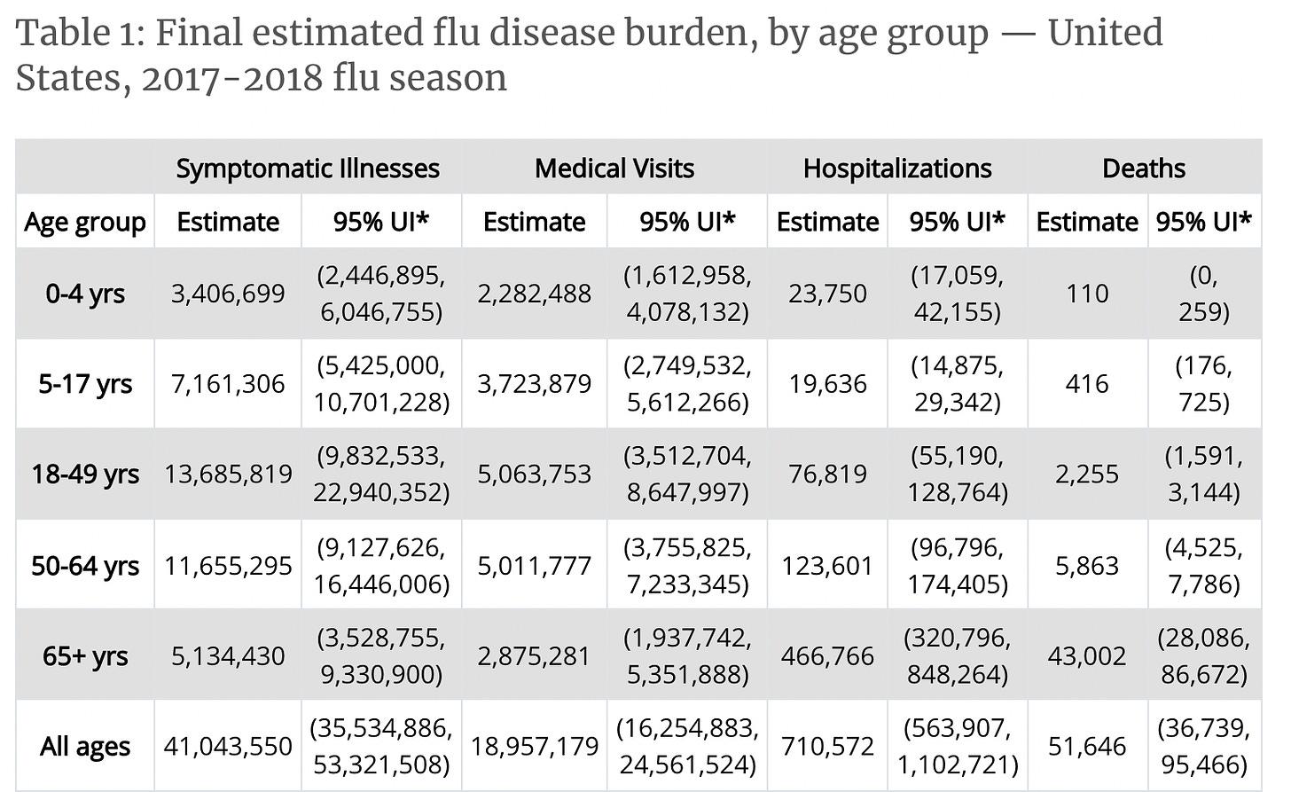
Ever wonder where they get the 0.1% infection fatality rate for influenza? The CDC publishes seasonal “burden” tables which act like a funnel: infections > doctor visits > hospitalizations > deaths. So, looking at the heave 2017-18 flu seasons we get:
The numbers change from year to year but if you divide 51K deaths by 41M infections you get the 0.1% infection fatality rate. The case fatality rate is more difficult to compare to COVID-19 because not every doctor visit ends in a confirmed influenza test or culture. By comparison, we now run MILLIONS of tests daily for COVID.
(Side note: Dr. Fauci REALLY messed up one day in front of Congress and confused CFR and IFR for COVID-19. It’s very likely that one mistake is what sent the panic rolling through our country ending is disastrous lockdowns.)
Back to CFR and race. Let’s break it down:
This is still manageable to just look over as a table. You can see that the CFR for 0 to 19 year olds is very, very low but you can also note some unique cells across ethnicities.
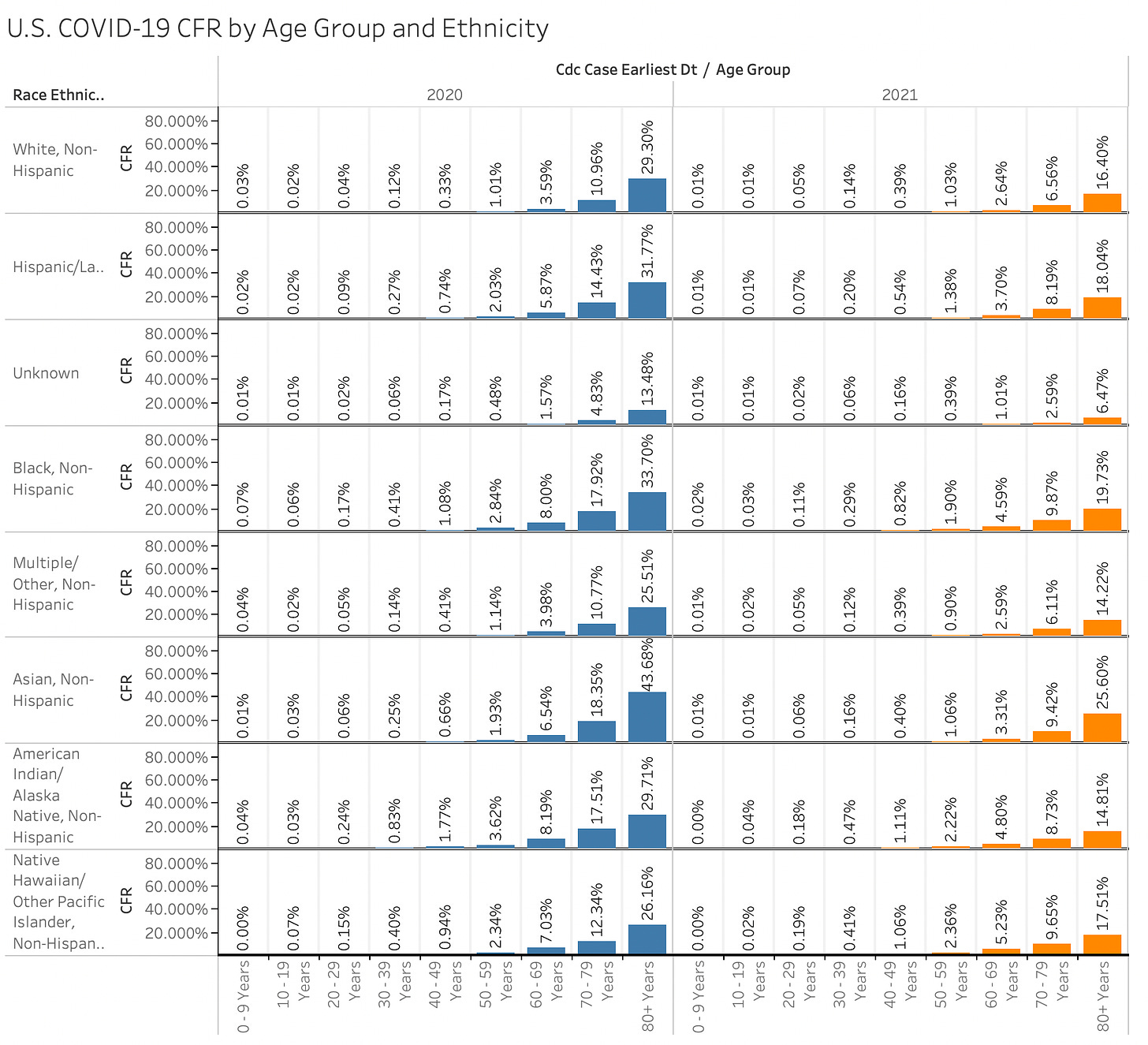
Blacks between the ages of 20 and 59 had some of the higher CFRs compared to other groups.
Native ethnicities and Islanders also see younger cohorts with higher % of deaths
Asian Americans have the highest mortality rate for the at-risk 60+ age
We know that obesity is a challenge across ALL of these age groups (thank you food pyramid!). I don’t have cohort breakdowns for obesity rates by ethnicity but it wouldn’t surprise me to learn some correlation there.
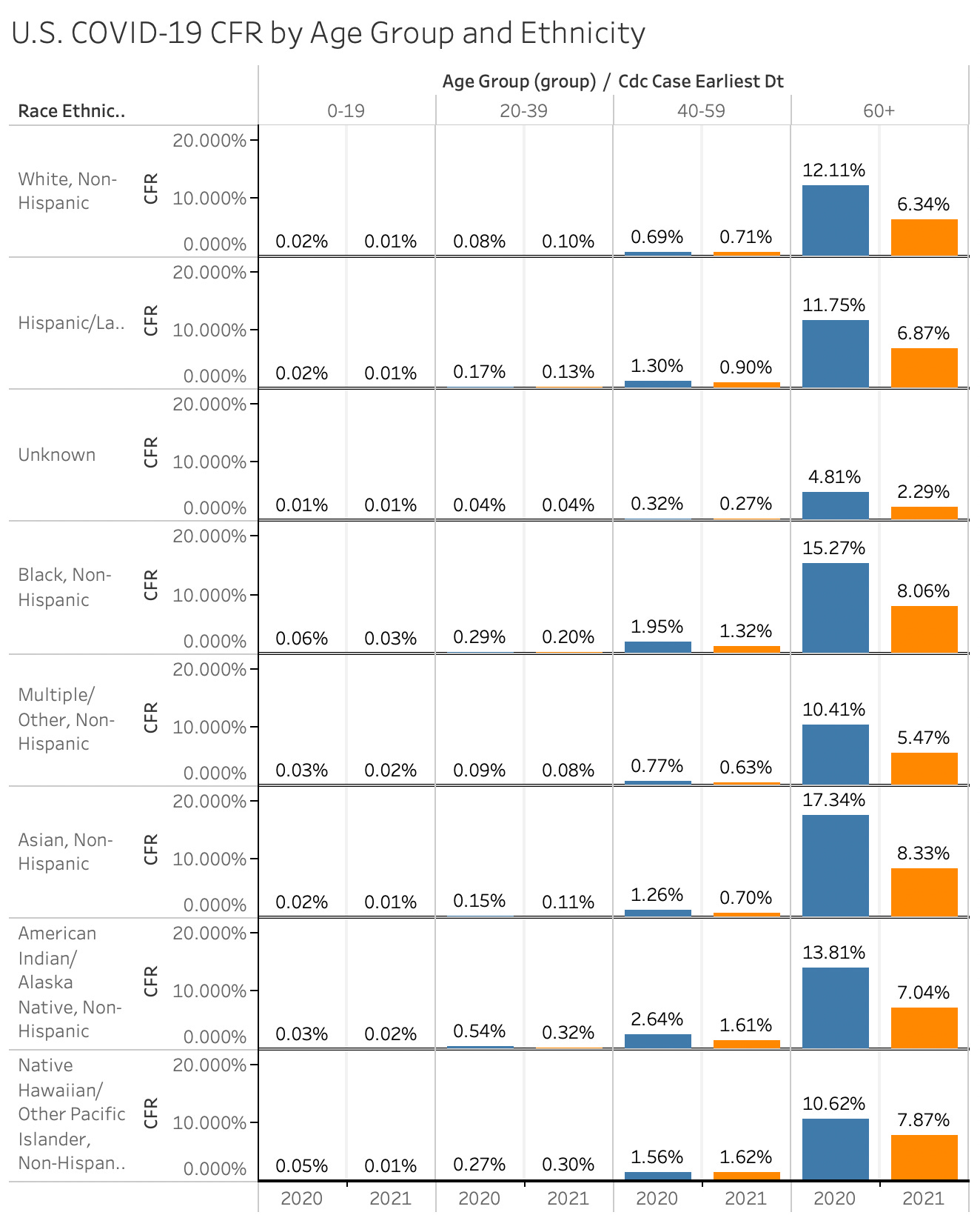
Now, if we look year-over-year we can see that the overall CFR has dropped. A word of warning: this might be an artifact of testing. PCR and other testing regimes have EXPLODED in 2021.
Here’s a chart of the YoY differences from the table above:
I would love to hear your feedback. What do you see in here? Share with us your insights in the comments below
Here’s a REAL granular look at it with years on columns two different ways.


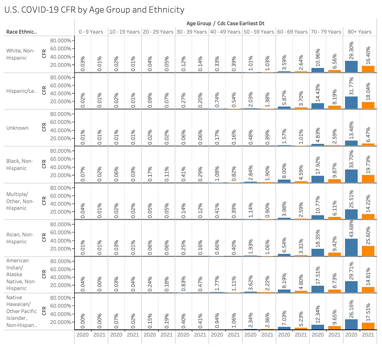
Increased testing between 2020 and 2021 should simply be course-correcting the actual CFR. If in 2020 we weren't testing enough to learn of all of the cases, and in 2021 we have a better idea, then we should in theory be closer to the actual CFR than we were in 2020. the 2021 numbers should be more reliable, and the sign change between the two years should be indicative of future trends in CFR when more data comes in.
These charts show elderly Asians to be the most vulnerable group for covid but the media has not made anything of it at all. Wonder why it is never mentioned?