Note: are you a paid subscriber to Rational Ground yet? Update your subscription and help us keep the website up and the analysis flowing!
The Red COVID thing is nonsense.
The lie is this: the Trumpiest Trump voters are to blame for lack of vaccination. But they're doing most of their analysis at the STATE level. 50 data points?
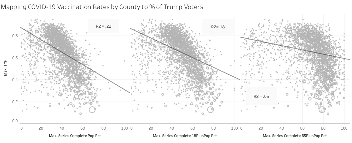
Let's try 3000+ data points and bring this down to the county level. Correlation between county, trump vote and vaccination % is tepid at best.
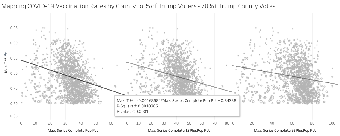
X-axis: vaccination rate
Y-axis: % Trump vote
Size: population of that county
Chart #1: All Counties
Chart #2: 70%+ Trump counties.


I like your idea, and admire your ability to pull together all the data. But the blobs have a definite elongated shape, all pointing down and to the right. So even if the correlation is poor, that's not surprising. The points would not be expected to lie perfectly along a line unless Trump voting were the only input variable. It looks like all have P values <0.05, so the relationship is statistically significant.
Anyway, the more reddish counties may not be to BLAME for low vaxx rates, maybe they can take the CREDIT for them.