We’ve had these posters and images up for a while and the stats have remained pretty much intact. We’ve always found it best to find real-world relational risks to bring into the equation. So, feel free to tweet these out, pass these around or print them out and put them around the office :)
Note: Are you a paid subscriber to Rational Ground? We’re counting on you to help us keep the content flowing. For paid subscribers you get access to our weekly updated tables and excel files. Get timely updates and interact with our content as a paid subscriber!
Check it out here.
https://covidreason.substack.com/subscribe
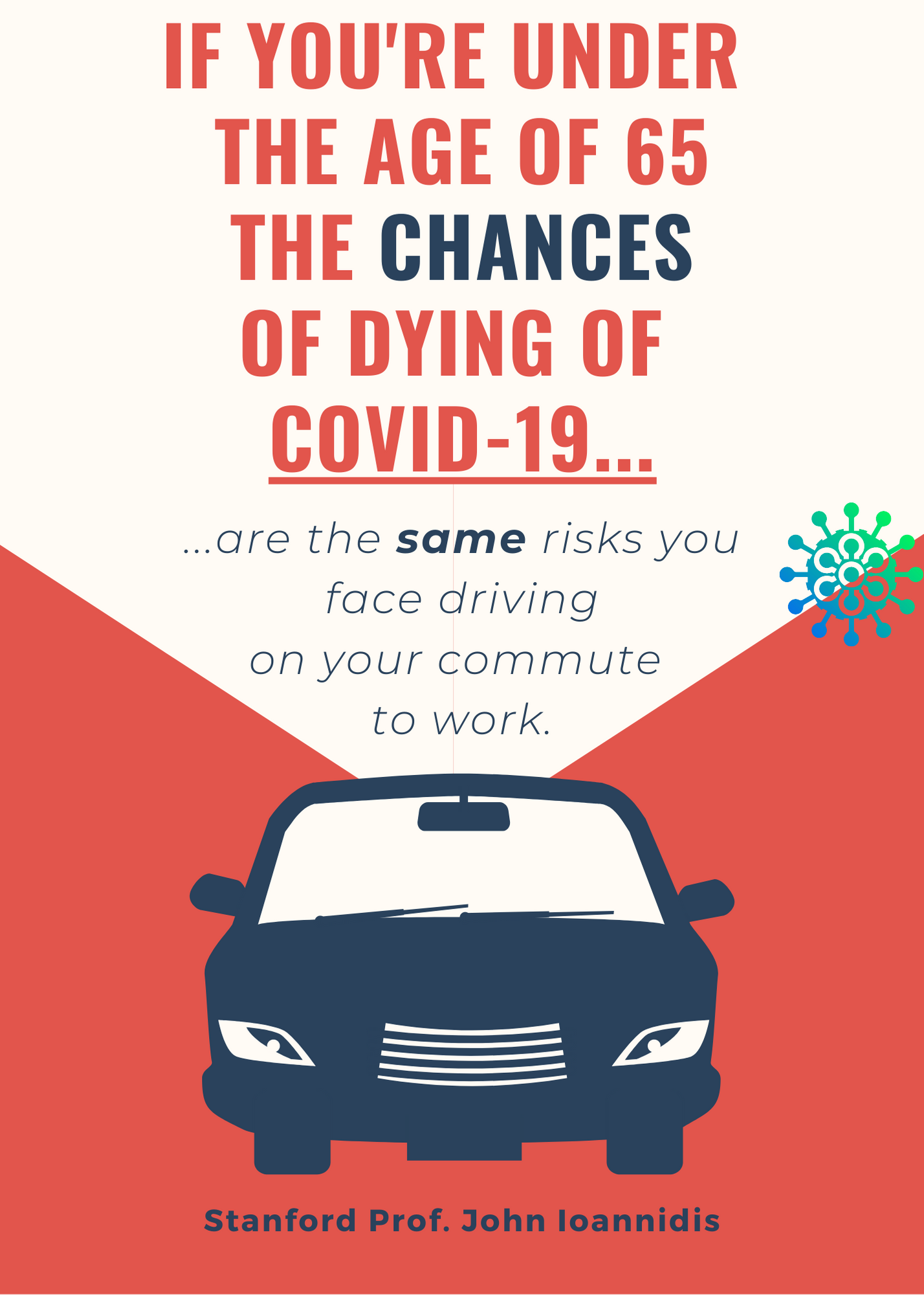
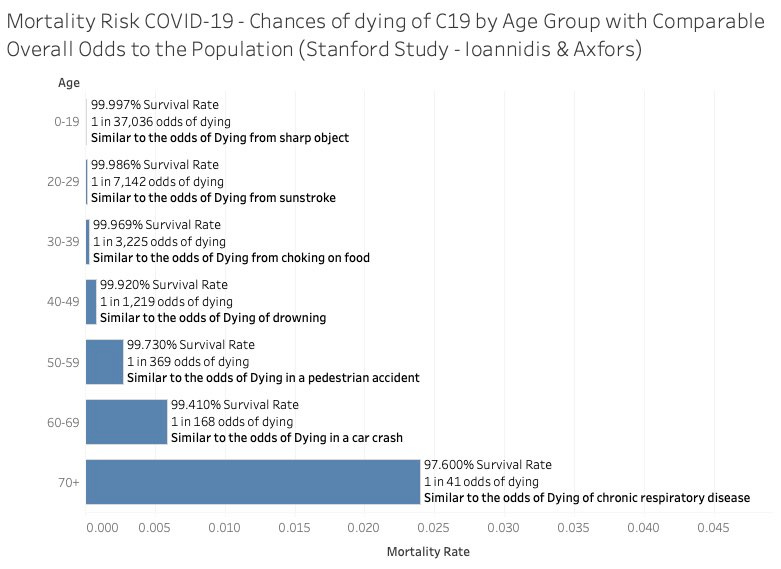
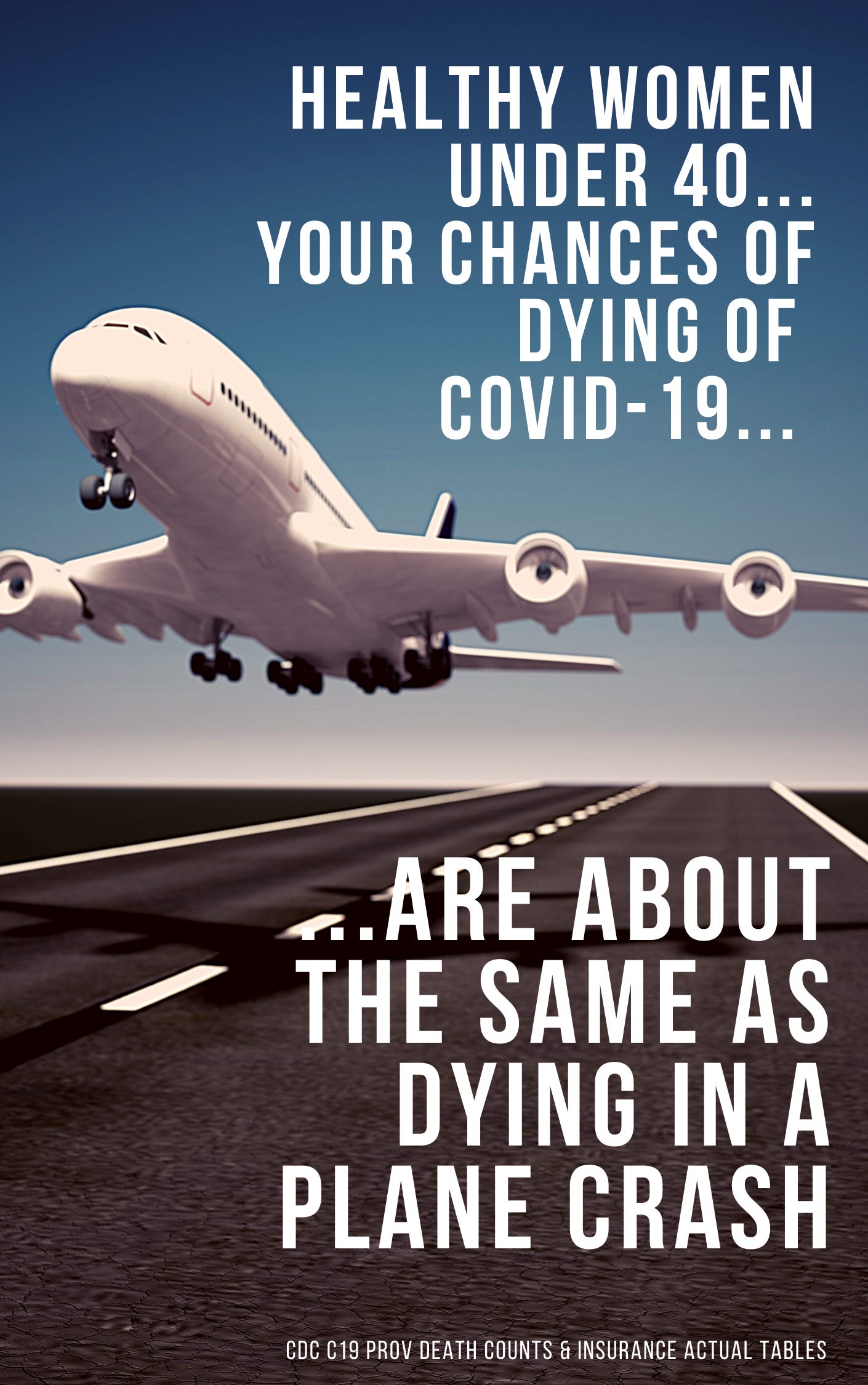
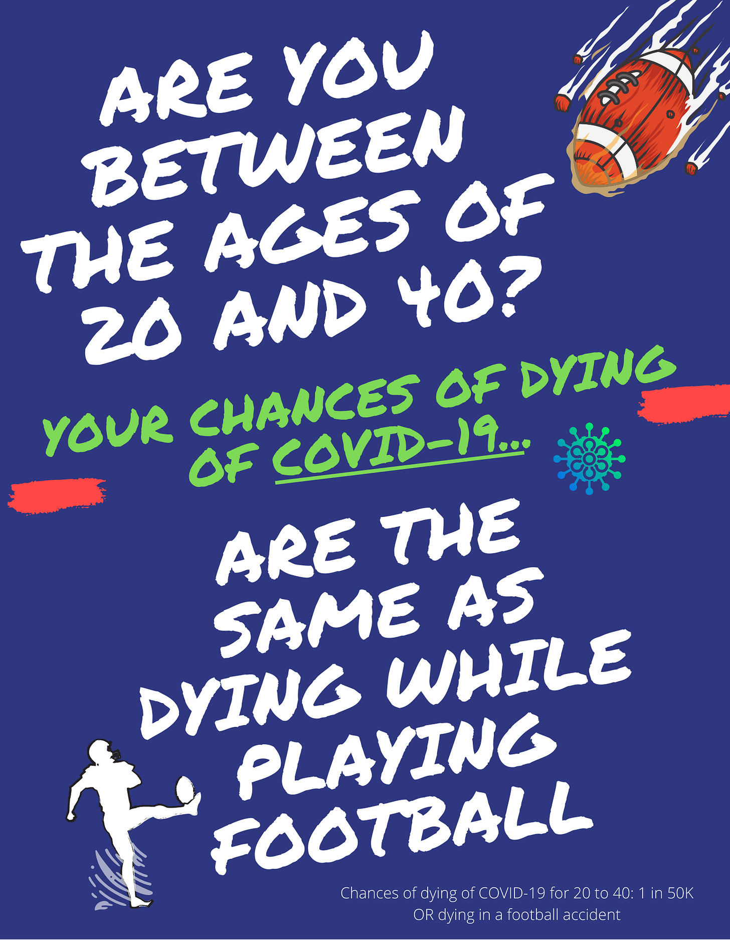
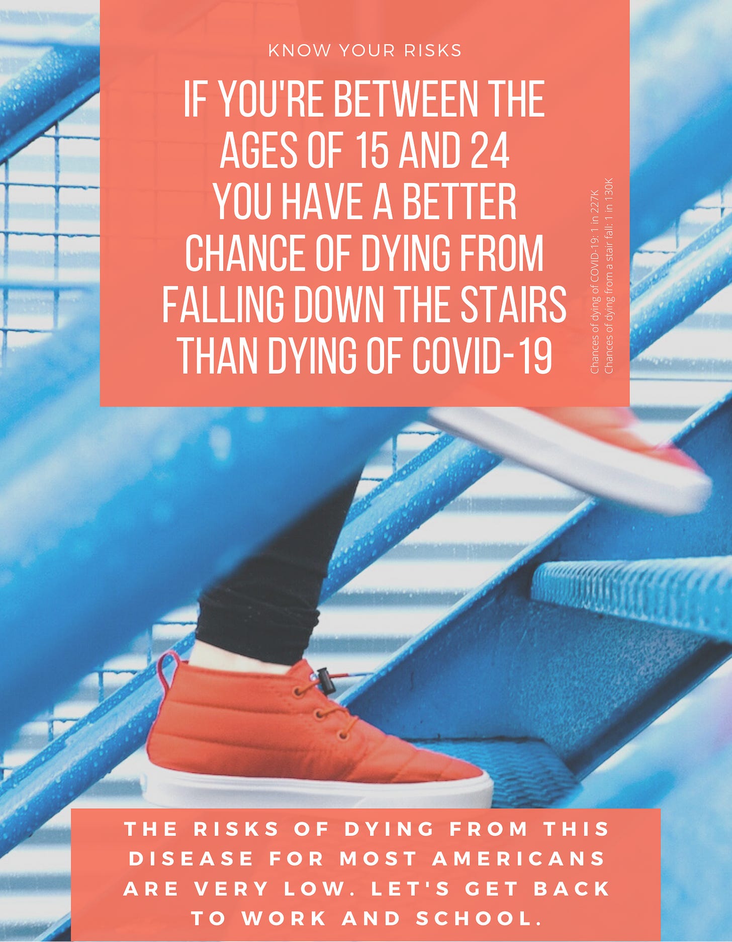
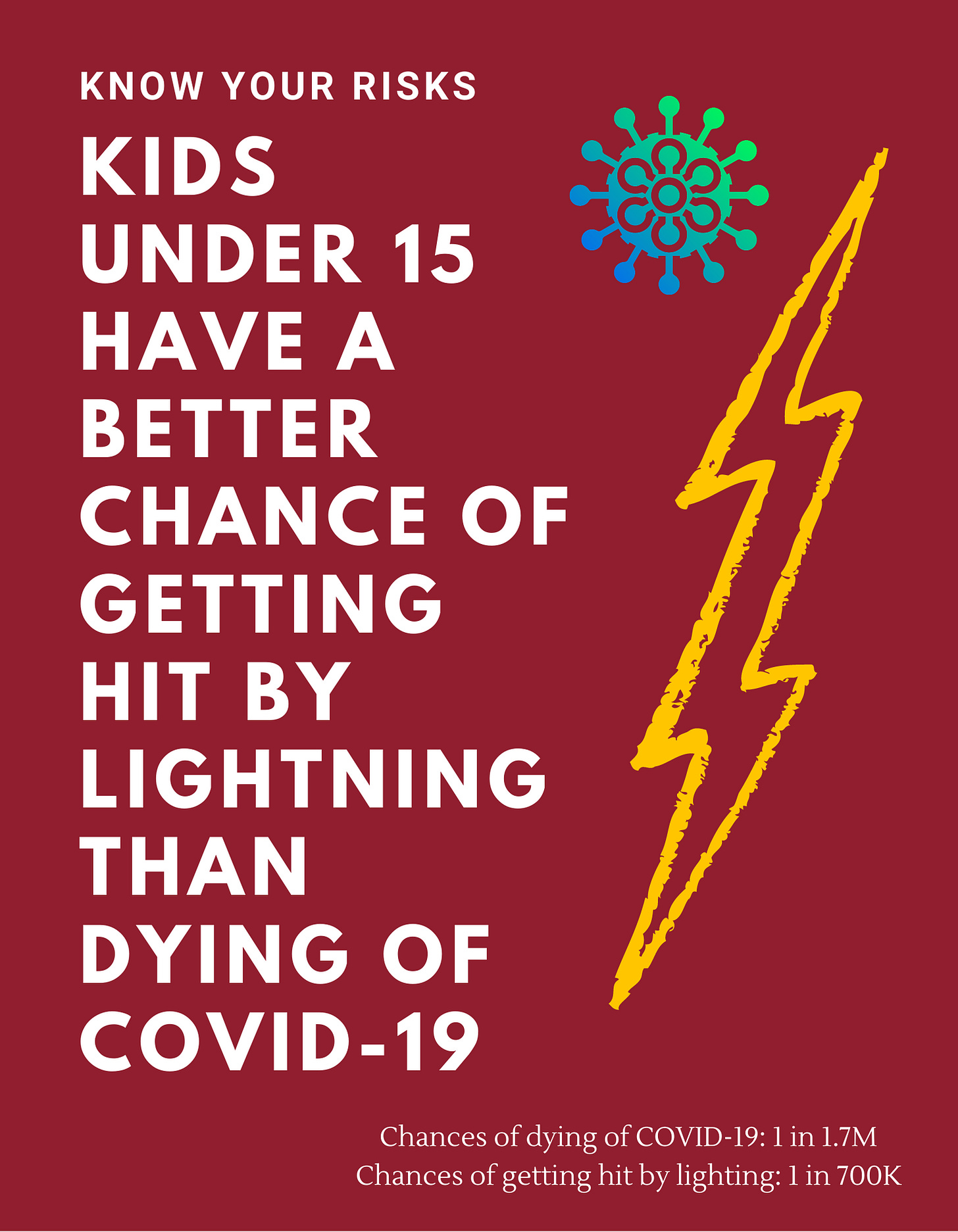
Using information from the iii.org we were able to piece together comparable risks of dying of COVID vs other risks.
The entire purpose of these posters is to put to rest the outrageous fears which have gripped the world over a moderate to low pandemic disease.
Obese men dominate the mortality tables for COVID-19. Women fare much better.
This one is more controversial… but looking at the mortality tables anything under 45 is almost unmeasurable. Of late, things have gotten worse for this age group in the all-cause mortality waves - but that has more to do with lockdowns than anything else as I see it.
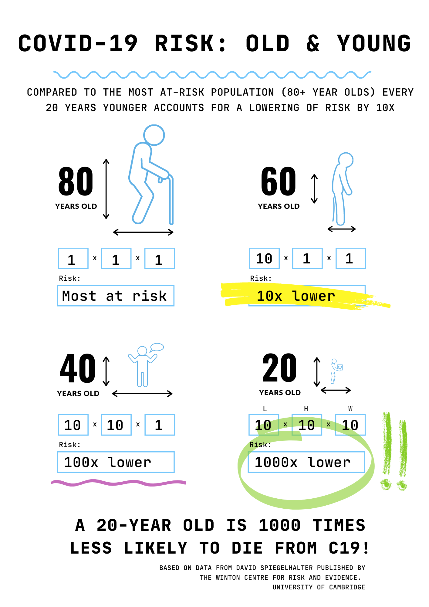
Once you get down under 20 the chances of dying of COVID are a 1000x less than an 80 year old.
Since the course of the pandemic about 400 children under the age of 16 have died of COVID. During that same time period about 56K children have died of other causes.
This one we did on the style of an OSHA campaign. Legit, for every 20 years under the median age of death (80) your risk drops 10x. So if you’re 40 it drops 100x and if you’re 20 it drops 1000x compared to the risk that an 80 year old faces.


But are these posters "double-blind randomized" posters?
This is wonderful. Thank you!