The Mighty CDC Case Surveillance File
Love it or hate it... the CDC Case Surveillance file is the data bomb. Paid subscribers - special dataset for you at the end!
I visit one page on CDC.gov multiple times a day: their data catalog: https://data.cdc.gov/browse?sortBy=last_modified
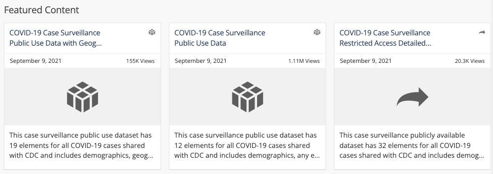
At the top you see 3 “featured” datasets: the CDC Case Surveillance File. The middle file the one I use the most and it’s updates maybe once or twice a month. A “caseline” file (popularized among us COVID data nerds by the very good and now defunct Florida Caseline File) puts a single person - a single case - on a single row in a database with toggles on hospitalization, death, demographics and more.
Why am I bothering you with this? Because the file we’re after is 3.6 gigabytes in size and has 29.9 million rows. Excel will crash before you get to the first 5 million records probably… so I’m providing you analysis from programs I have access to which can handle said file :)
The middle file is the one I use. The GEOGRAPHY case file takes stats down to the state and county level but for privacy reasons it EXCLUDES data points with fewer than 10 records at a demographic intersection - and it only has the data on a monthly basis. So, if 7 Hispanic 10 to 20 years olds die in Orange County in May of last year - that will show up as a zero. The RESTRICTED case surveillance file has more meaty details on illnesses but also suffers from this “privacy” policy exclusion.
So - let’s get into it. I’m gonna start spitting out charts going down and down into more granular detail. This includes everything through August 15, 2021 essentially (more updates will be coming). I’ll provide exported EXCEL downloads of a master set of data at the end for y’all!
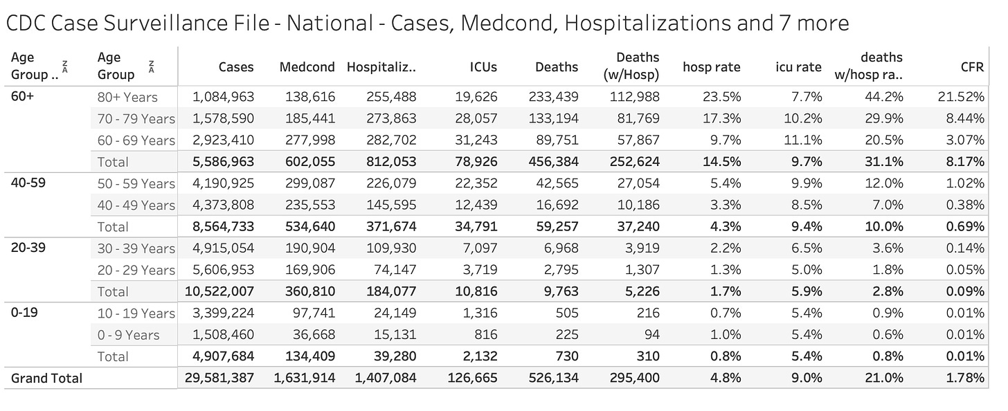
Two Age Grouped Tables - COVID-19 Stats Since Jan 2020 through August 15, 2021
Basic stats above by two different levels of age grouping with sub-totals.
Cases, Hospitalizations, ICUs, Deaths you know.
Medcond = noted medical condition.
Deaths (w/Hosp) are deaths which ALSO have a hospitalization note
hosp rate are Hospitalizations / Cases
ICU rate is ICUs / Hospitalizations
deaths w/hosp rate are deaths to hospitalizations with a hops. status marked as “yes”
CFR - the raw total of deaths / cases
One might wish for a different breakdown of ages but consistency is NOT something we particularly find in government work.
Some highlights from the age chart above.
CFR for ages 80+ is very much larger than any other age groups. 21.52% vs. 8.4% for 70 to 79 year olds. As one of my colleagues notes: If you’ve ever met anyone from the Civil War then you are the MOST at-risk group.
Notice how the 0-19 group is almost unmeasurable on a scale. As one of our graphics notes:
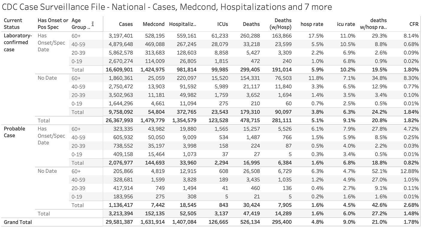
Let’s go on to the next level. This breaks up our stats into 2 grouping levels:
1) Laboratory-confirmed and Probable Cases - In many instances hospitals or counties receive data from patients with symptoms or criteria which indicate a COVID-19 case but have no confirmed lab result. This will be a discussion point for the next decade of medical research as we try to discover dying with and dying of COVID-19
2) Has Onset/Spec Date - One advantage of the CDC Case Surveillance File is that it tries to find the earliest date for the case. Ideally, you want to know the “onset of illness” date and if you don’t have that you want to know the date the specimen was taken and analyzed
So, as you can see there are 299,405 deaths for COVID-19 cases which have a lab-confirmed test result and also have a date of onset illness or a specimen date. Does that mean that the 600K+ deaths touted in the news are likely over counts? In by book - yes… but others might come to different conclusions.
Certainly, if we are comparing Apples to Apples, influenza is logged and captured with that level of certainty (confirmed lab and onset date). More analysis of that at another time.
Here’s another way of representing deaths in this cascade:
So, 50% of all deaths occurred in 60+ year olds with a lab-confirmed case AND an onset/spec date. Just another interesting visual to digest.
We also have all of this data by date so if we roll up to months you can see the trends nicely:
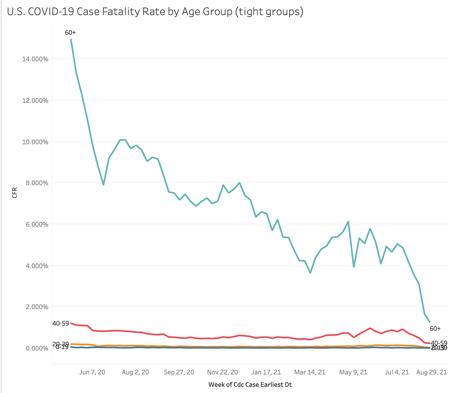
Here’s the same info looking just at CFR by age group:
As you can see we’ve done SO MUCH BETTER in recent months to stem death but we still have a LOT of missing data.
I’m certain you can glean some interesting stats from here as well. Let me know what you think and as promised - here’s a roll-up excel file of age, date, and stats.
Also - as a LARGER treat - here is link to a LARGER file with cases and deaths down to the county level (bases on the NYT Github data) and including (in-line) demographic details for each county. Enjoy and thank you for subscribing!


The one challenge in my brain on all this is tied to the level of accuracy of what are being called COVID fatalities. I do not believe that the tests are accurate from everything that I've read. That said, all this data is very interesting.
Thank you for analyzing all this. It’s WAY above my pay grade so I appreciate how you are combing through it, and all of your insight.