
The Ultimate Single Data File
Start your analysis here!

Correlation is not causation but it’s so satisfying to find one!
Getting data out of the hands of the CDC and others is difficult. If you’ve ever wandered around the CDC WONDER database it’s enough to make you rip your hair out. It’s like they purposely designed the UI to haunt you in your dreams.
Well, we try to make things simple for our subscribers… and this took A LOT of time to cull together but we think it’s worth it.
This file has (almost) every FIPS (county ID code) in the U.S.:
County name, State
total cases per 100K (as of 11/30)
total deaths per 100K
then totals for cases and deaths
2019 population
Next vaccine series data
Then a complete mix of data from various demographics AND the newly released 500 City project CDC health database
And to boot! a Trump% vs Biden% for each county
So, if you plot the deaths per 100K against the 500 project field OBESITY (the prevalence of Obesity) then you get this:
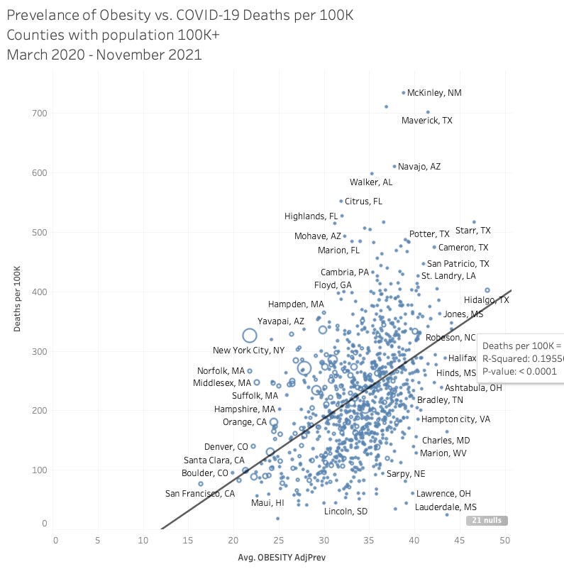
I’m told with the confounding measures and the massive amounts of data points that a .2 R-squared is fairly strong. In other words, there DOES INDEED seem to be some correlation between population adjusted COVID-19 deaths AND the prevalence of obesity in counties.
We’ll be diving into this more but for subscribers, feel free to download the XLS file and play around with it.
