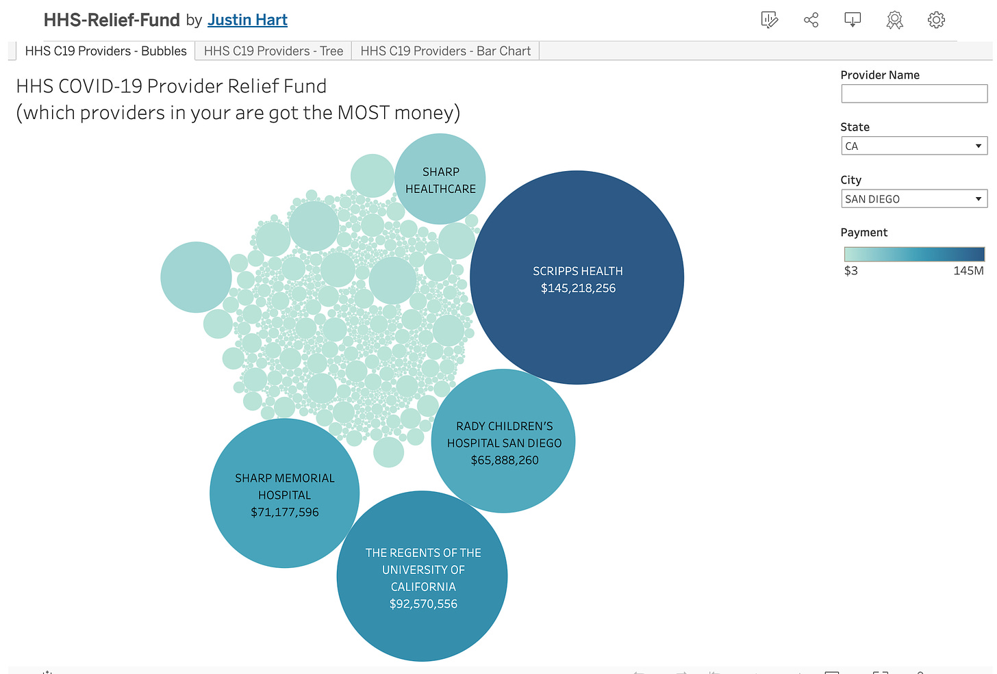
I’ve created a set of interactive charts so that you can get a quick glance into which medical providers received the MOST money from the HHS COVID-19 Provider Relief Fund.
It might surprise you. (It might disgust you).
Here in San Diego it looks like this:
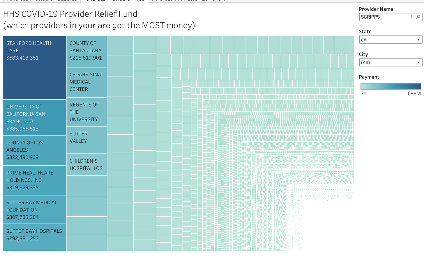
You can also view it in a treemap and/or bar chart:
Here are the links to the interactive charts for this subscriber-access workbook.
Of course, if you’re not YET a subscribers - sign up now while I have the annual discount window open!
Keep reading with a 7-day free trial
Subscribe to Rational Ground by Justin Hart to keep reading this post and get 7 days of free access to the full post archives.


